It’s that time of the week again where I pretend to be a ‘real’ designer; where I’m actually in charge of a project and my opinion counts for something that might affect some Norfolk teenagers, and inspire a new generation of children/ adults to visit galleries.
In my last post I uploaded a version of the logo that I’m working on, but I now have the actual version submitted to the client and a new version created out of the response.


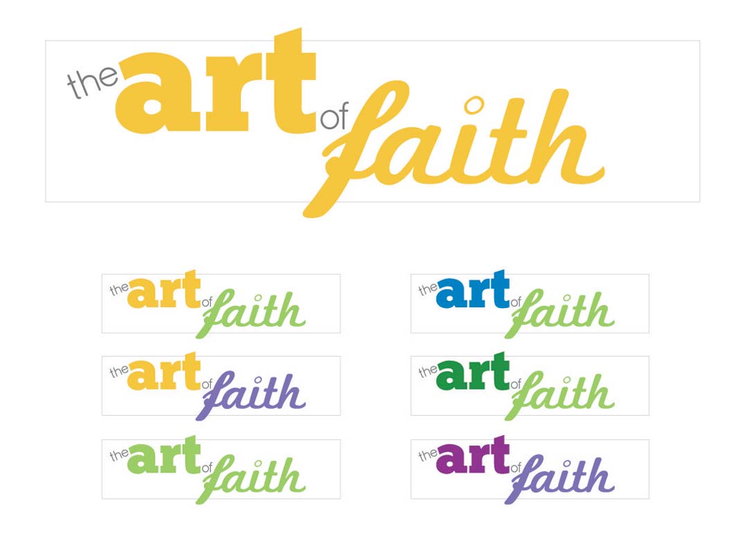
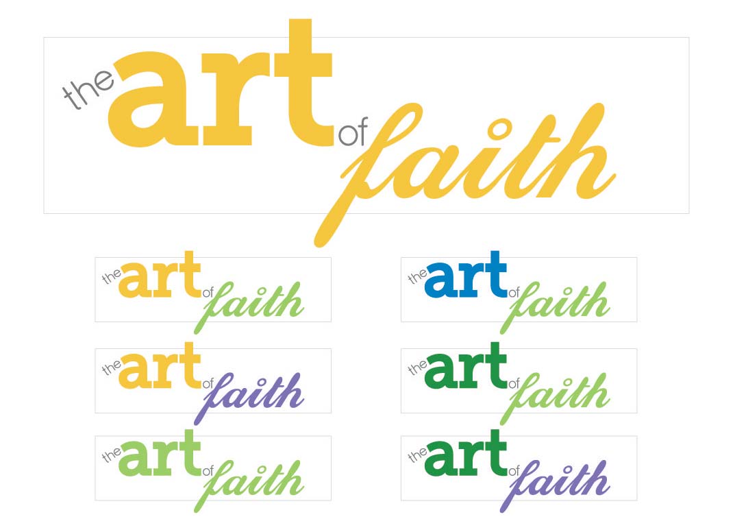
The 2 versions shown here are the original (top), and remake (above).
I personally believe that the original version is better due to the bolder ChunkFive font and the combination of two script fonts in the word “Faith”; whereas the revision has a sleeker more contemporary look that has a similar weight among the 2 key words. When the logo is ‘finally’ approved by the entire panel of judges then the branding commences along with the website.
