Recently I completed the identity and promotions for an upcoming exhibition, the way in which I tackled this was slightly different to normal projects that I have worked on, which was because Kirsty told me that I should do it for them and seeing as she seemed to be leading the exhibition I decided to do it.
To start with the title was one of those titles that evoke a certain image and that is usually the one that you end up seeing, this one happen to be clocks, as decided by the group as that. The most logical imagery that would be used, and being me I didn’t want to do that. So I started off looking at other time related images that could give a nice image to play with.
These consisted of diving, running and generally any sort of action sport that would give a provocative photograph; the ideas continued before I decided that the best way to represent the title was through the way in which he audience will receive it. A Moment Suspended in Time; to me sounded like a pause, so I came up with a few concepts to show the group and they really liked the flyer that gave the title in 3 stages.
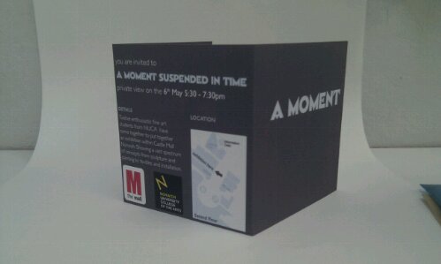
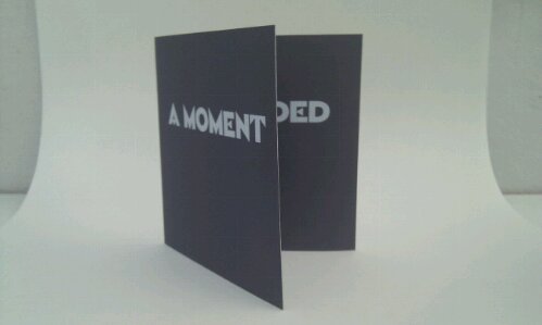
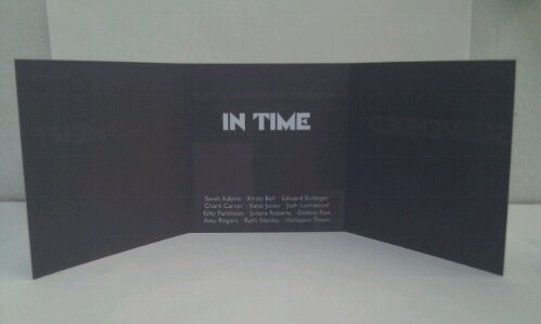
Below I have taken a few quick shots of what the flyer (in this case the private view invite) looked like once I had printed a Master copy, the whole piece was considered down to the stock (Epson Double Sided Matte, Coated, 178gsm) but in the end the actual flyers were bulk printed in black and white which meant that a lot of the style was lost, but the main identity was kept perfectly.


The images above show you what the design should have looked like if they had been properly printed out, but for them they decided to save money and do it at Uni where the colour laser printer was printing out the block grey background in stripes of blue and green, so we had to printed them out on the Black & White printer to get a reasonable quality as they are being handed out. These Invites are designed in the same way to the flyers so that the title can stay as a broken up title and thus keep the identity of the exhibition; where it was shown on one face the type was split up onto 3 lines with 3times leading so that there was a big gap between the words and thus keep the identity going even thought the media inhibited it.
There are a few problems with the overall exhibition, these being:
Lack of communication between ALL group members.
Lack of Finances, or lack of wanting to pay for anything.
Not compromising for the good of the exhibition.
Which leads tot he fact that, A – the T-Shirts are white with grey text and made with iron on transfers (not my advice or design, the final one was taken from the poster and adapted for the t-shirts by a group member), B – the exhibition layout is pretty much destroyed by the fact that certain people will not budge on favourite positions, which would not only make sense but make the overall feel of the place better, and finally, C – the lack of overall support by ALL members has created a stressful and somewhat un-workable atmosphere between some of the members.
On the whole I feel that the exhibition will run smoothly and there will be a lot of press to accompany it throughout the showing, if you want to find out more (well not so much more, as the blog is not being updated as much as it should be in favour of Facebook chats and status updates.) but a place where you can see more at least about the artist themselves.
