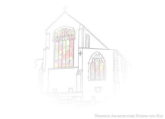
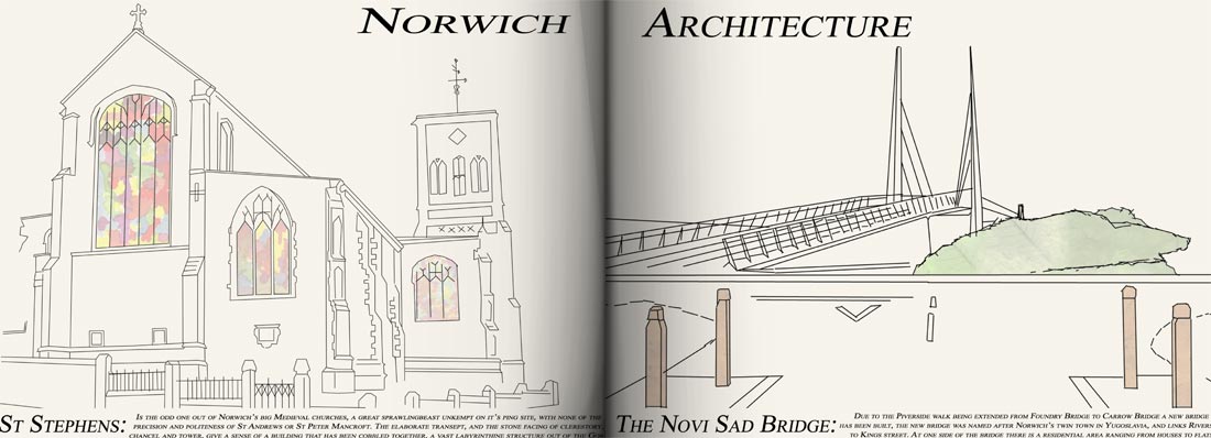
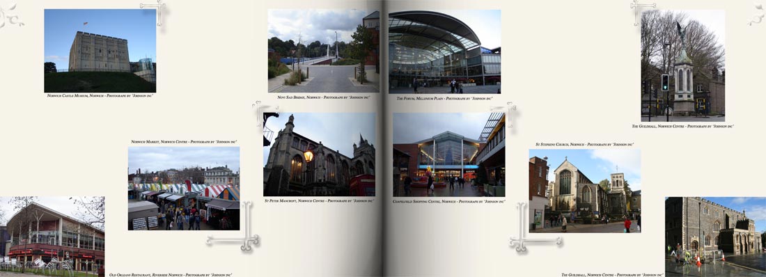
Way back during my A-Level Graphic Design days I came up with a self initiated project which was made up of 2 book that were to showcase Norwich; called “Norwich Architecture During the Day” and “Norwich Nightlife”. Both of which went through a lot of designing and led me to scrap the nightlife book so that I could concentrate on the architecture book, as this had a better idea and interested me a lot more as Architecture was my degree of choice before I found out about the cost and chances of that happening. The initial idea of the book was to just have pictures of the architecture then have the book look old and such like, more style over substance; this then turned into a larger project, a poster, badges and the book were my finals back in the first year of my A-Level.
As it had always interested me and that I really loved working on the project I brought it back to life in a ‘what else do you do week’ in the first term, back in October 2009. This led me towards taking new photographs where needed, and creating illustrations from them which accompanies a small description of the architecture depicted, but due to the degree that I have now finished I was able to set up a template for the book, which made the information standout as much as the illustrations which are still ongoing.
-The Old Version-


Just so you know, the text going up to the edges of the pages is not a web formatting problem but how I had actually designed the pages, and yes I know it is really bad typography, layout but a really nice concept and idea that I have been trying to get right recently. By taking the photographs again I can control the full look if the new design properly; the illustrations come straight from the photos and I take a lot of time getting all the details right as to do the historic architecture justice as well as give credit to the contemporary architecture.
As most people have not seen the architecture book I’ll leave this post for you to look at and hopefully comment on, the new versions will be posted soon.
