Now, to begin with I’d like to declare the fact that I am a big fan of this style of design but I have not been able to mimic the style to give it the justice it deserves. Secondly I did not grow up with this show and have fairly recently stumbled upon this gem of design, and I love the show almost as much as I love the title that precedes the show itself.
The show in question is “Jeeves and Wooser“(imdb article) which stars the infamous Stephen Fry (@stephenfry) and Hugh Laurie.
{My Synopsis: Laurie’s character Bertie Wooster is a dim aristocrat who has the very intelligent man-servant Reginald Jeeves, the man who sorts out most problems that present themselves. It’s a funny, witty sitcom that is enhanced by the cast, that can also seem a bit outdated to the youth of today.}
Title
Credits
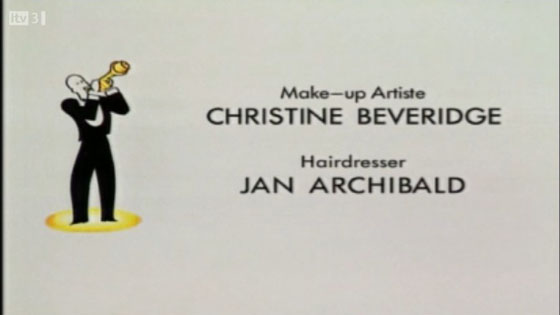
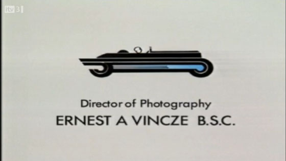
The Design
This design has become popular by the phrase ‘Vintage‘ or ‘retro‘ despite them also describing a lot of the design from the 50’s and 80’s respectively, where the show is actually set during early 30’s, pre-second world war.
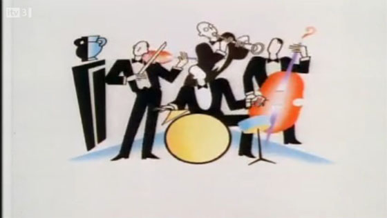
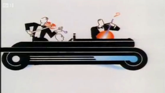
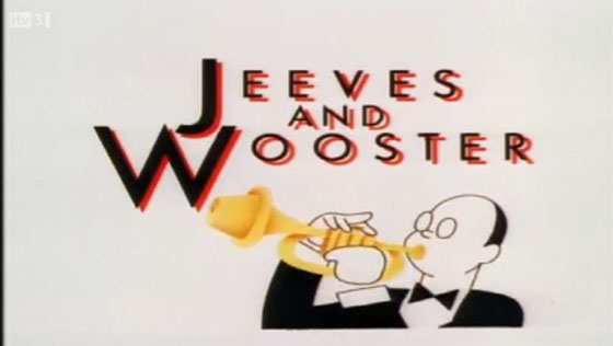
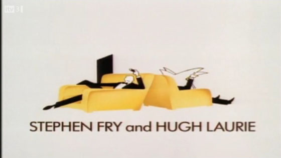
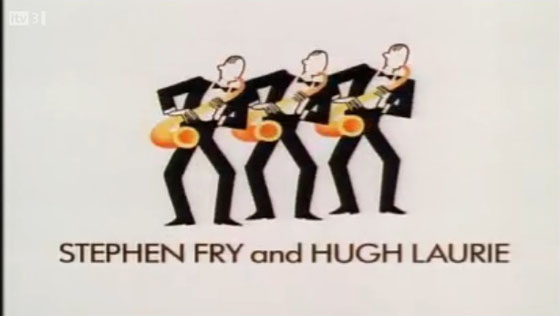
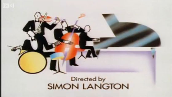
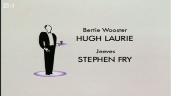
I love the simplistic block colours and graphics, they are however, much more elegant during the title sequence than they are as flat graphics, I do however love the idea of having a series of postcards, posters featuring some of the graphics on show, especially the car, the title of the show, the 3 musicians above the actors names and the chairs, also with the actors names below.
The scenes blend together beautifully, a man playing the clarinet pops up behind the drum player within a spiral, and as the music continues, a car drives past the stage taking you towards the next scene. these little transition last a few seconds but look amazing within the context of the design.
