A design query rather than the food.
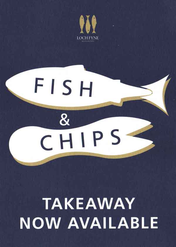
While in Bath we walked past a Loch Fyne Restaurant where they had a promotional leaflet outside which caught my eye, mainly because it was lunch time & I was hungry but also because of the way in which the imagery had been portrayed and captioned.

My query is that the image of a fish is shown as a simple vector of a typical looking fish, which in this situations looks and feels fine, but it’s when you see the chips image they give you the shape of a chip fork; not a chip but the utensil that you use to eat one if you don’t like to eat with your fingers. (which I do, the best part about chips are that they are a ‘finger food’)
If we look at it from the other way round the query is still there and I still don’t get it, the chip fork represents the way in which you would eat chips from a take away, but the fish doesn’t show the way in which you should eat a take away fish; how does this imagery work, how the 2 images work together I don’t fully know. To top it off they have the descriptions of the service written on the items themselves, not either the image conveys the message or the words convey the message, why would you need both the type and images to get across the idea that they do Fish and Chips at a fish restaurant?!

2 replies on “Fish and Chips Leaflet”
I quite liked this as it has a very traditional feel. I’m not doubting your perceptions but lets face it, at least it’s better than many fish & chip shop print outs you see most days.
My quarm is not with how nice it looks overall, but why they chose to use 2 different types of imagery on the same flyer. This is by far the nicest looking, and feeling, of all the chip shop flyers I have seen.