Your probably wondering how the title for the website came about?
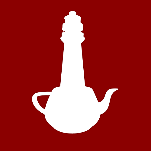
Well it began on a dark night in over cramped office… (couldn’t resist). I wanted something thats sums me up as a person but was catchy enough and would spark imagination. I love tea and teapots id always seem to find a way to bring one of them into my Art degree, which im sure my tutors didnt appreciate.
When myself and christopher got married in 2014 we put on an exhibition in the theatres gallery. For this I painted a triptych (which is a set of images that hang together as a set of three, if you didnt know already) of teapot lighthouse, I feel they are my best work to date. This triggered our imagination as to how many other combo ideas we could come up with, and how we would create a website to showcase our work and blogs.
Our latest creation is coming up with image thats sums us up and looks great, below is the latest idea which we really want to get created into a neon light sign for our office.

- Its iconic red, white and black for lighthouses (most people if asked to describe a lighthouse would say white with red stripes).
- The type is fluid and visually appealing, working well in and of the 3 colour combos.
- I can’t remember the other point, other than I just love it and thats all that matters.

