Categories
The Creative Cakery

@Bristol

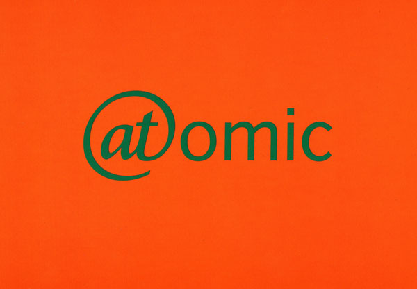
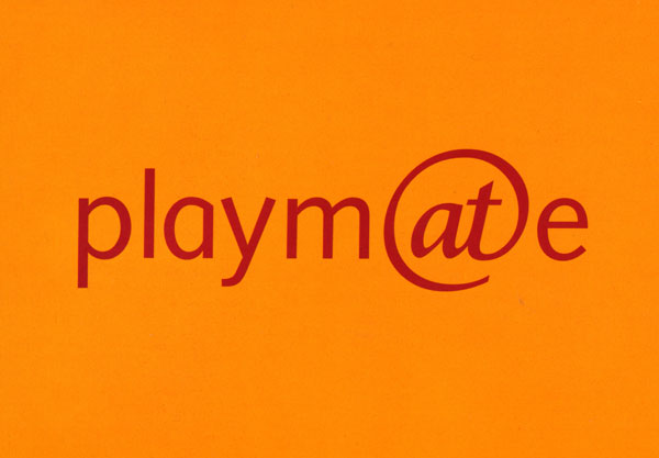
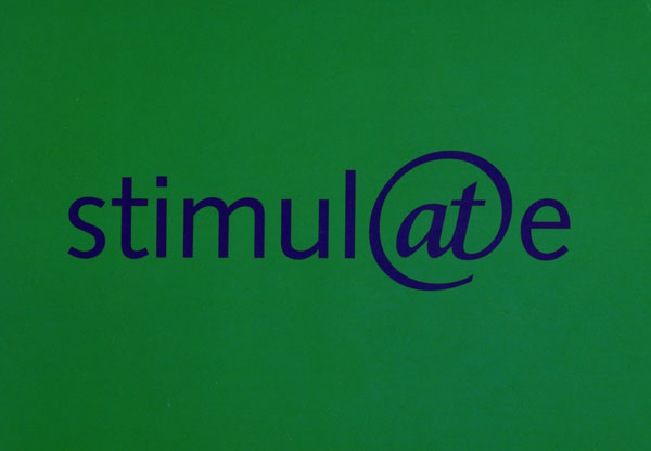
A splendid collection, all be it a small collection, of nicely designed postcards for the @Bristol museum; brought in their gift shop, because they were so nice.

4 brightly coloured postcards don’t seem so nice at face value till you see the way in which they have captured the identity of the museum. Initially i thought that they had lost the point when i tried to say the 4 words using the @ to say ‘at’ rather than use the ‘a’ and ‘t’ separately, as they have only put in the symbol to link it to the centre; which keeps the identity flowing through all of the merchandise  on offer.

-stimulate-

stimulate

-atomic-


-playmate-

playmate

-innovate-

innovate

Categories
The Creative Cakery

Tease Made at Start

On the Monday of our holiday we decided to visit the Tease Made Exhibition in Bristol; an illustration exhibition showcasing the talents of Chris Dickason & Peskimo.

Teasemade Flyer

Being a person who likes to plan things I was very annoyed to find that we had turned up during the exhibition dates but while standing in the pouring rain outside the place we thought it was, nipping in an asking to find that we had just go the wrong door, no harm done we thought, no the gallery space was where we thought it was and on this very wet and cold day standing outside a locked door we look at the flyer again and discover that, like most places now…it Doesn’t open on a Monday, the new Sunday. very annoyed and wet we continued our day missing this exhibition out.

On the Wednesday before coming home we decided to revisit the Start Space Gallery place; this time the weather was better, not good, but better and the door was wide open and inviting, we had turned up 40minutes before they were scheduled to shut but we assumed that it might be a bit more of a buzz, alas we were the only people there.

The exhibition space was split into 2 rooms, the lobby area where the organiser sat at a desk, and the back room where all the work was displayed, like a lot of the smaller new age exhibitions the work was printed and hung on the wall with Bulldog clips for the main part but where the work got smaller or more tactile the layout changed; for example there were a selection of soft large-scale sugar cubes with faces, and a wide variety of hand drawn, painted and sketched work just stuck to the wall.

The flooring was a bit scary in places where it seemed like there was a hole but a bit of board was enough to cover it up, now i know this wasn’t the case but i felt a little nervous about standing on that space for a long time, which meant that i didn’t look at one piece of work as much as all the others.

-The Work-

I didn’t pay that much attention to who’s work I was looking at as this was not nearly as interesting as the work itself, all of the work on display was amazing, the colours very vivid in places, the textures were lovely and the compositions compliment all of the above,but the best bit was the content, the work seemed to be humorous, witty and serious while causing a debate all at the same time but just on the subject of Tea…what!?!? a stereotype drink for the English causing the talents mentioned to create the work they have, a strange source of creativity but with a great result.

The big work was great to look at and you can but only gawk at the outcomes with envy but tit was all of the little pieces that caught my eye, the small pieces that had a lot more character to them, the witty lines, the illustrations and the format made the designs jump off the page and seemingly (although not literally) dance around the room filling your mind with questions as to whether or not the words came out of fact, fiction of a dimension of their own, in the same way that the style encapsulated the content beautifully.

If your read this before the exhibition closes and you’re in the area, it is well worth a visit, Buy Cialis it depends on how much you take an interest in the work as to how long you’ll need, but 45minutes gives you a long time to study the images down to the way in which the colours are printed next to each other and not blending, to the grain of the paper itself. I don’t know that the place is like at the moment but what i can say is that the Start Space give out a Wicked and well put together goody bag, the bags were printed with one of the illustrations and filled with the usual business cards, flyers and advertising but i was, to Kirsty’s annoyance, lucky to find 3 pieces of signed work included in the bag, one being a signed print by both illustrators, and 2 Peskimo hand drawn pieces, a standard looking postcard sized double water drop image on what feels like normal printing paper and a large square sticker which had a photograph of a building on it with hand painted clouds and a marker drawn character on the side, and of course all signed in the corners.

{More reviews and posts to follow}
Categories
The Creative Cakery

Long time no Blogging

March 5th you say, this being the last time that I blogged about anything, let alone anything interesting.

The reason for this lengthy gap is that I have been concentrating on university work and I’ve also been on holiday; only 4 days away in the UK but a holiday none the less, a few days away from everything – except the weather –

I have also been doing a lot more design work for Real Projects and the Art of Faith Exhibition, of which there are a few updates but no images, this is because I have not finalised the majority of the designs and want to unleash them as a sneak peek just before the live date which, assuming everything goes to plan will be the 15th April.

1.The Website has been completely designed & is currently being coded.
2.I have been working on some of the game designs, but only one is finished, and is currently being approved by the client.
3.The Pledge wall has been sent off to be coded.
4.The presentation at the Cathedral was to showcase the designs to a selection of trustees and teachers.

and finally I’d just like to say that *This* work placement has been the best so far, the guys at RP are very good at what they do, they have allowed me to creatively tackle this project on my own most of the time which has paid; the interactions with clients and the large, daunting presentation has only helped me to develop.

-Aside from Work Placement-

I have recently been on holiday with my girlfriend to the western side of England, this being mainly the Somerset area; we stayed in Beckinton, and visited Bath, Bristol, Frome, Cheltenham. The reason for the visit was a holiday and an art trip, we scoped out there area first and found a little gallery doing an exhibition on Tea, which Kirsty is currently looking at for her studies, as well as textiles.

For now this is all I’m going to say here, as i am going to create new posts for all of the reviews and nuggets of info/ design.

Categories
The Creative Cakery

{iSlayer Review}

As noted in the previous post I don’t normally write reviews about things, it always seems like a waste of time and normally I feel that no one really cares what I think, but what the hell I’m going to tell everyone anyway.

Bjango

Bjango apps

islayer

islayer apps

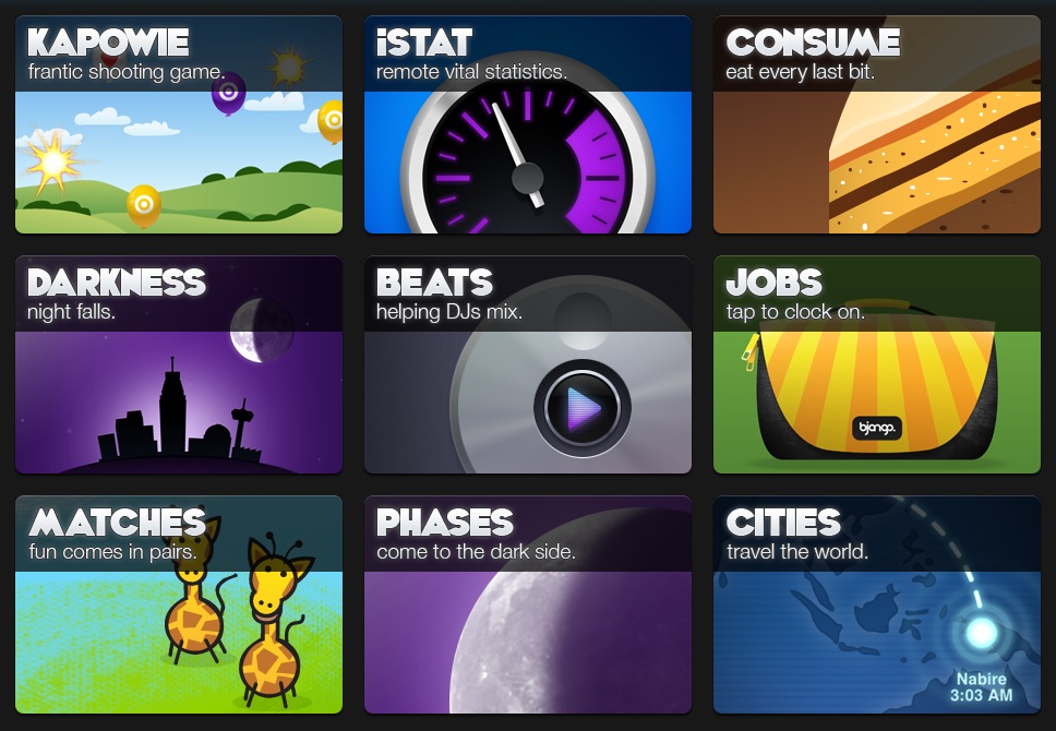
iSlayer is a small software company who design & build Mac related software; this is broken down into a few categories; one for the iPhone, one for Mac computers and out of these you have some very good statistic tools as well as the ever nostalgic and brilliant Lava Lamp.

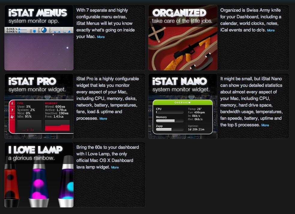
I have recently started using iStat Menus as it was compared to a network tool called “DU Meter” but for mac; this tool allowing me to see how much data had been used since log on for the broadband as we have had some download issues, which we found out to be the throttling of Virgin Media once you have exceeded the ‘fair use’ policy the internet download speed went from 10mbs to 0.3mbs.

iStat Menus is a very complex and useful tool for monitoring computer temperatures{making sure that it’s not overheating, make sure that things are working properly, to make sure that the fan is not obstructed}hard drive use and capacity{useful to see if you are running out of space} and the reason I downloaded it, the network functions{how much data you have used, which helps you keep an eye on prices if you have to pay for data, e.g mainly if you have a portable computer with 3g internet} the applications are very well designed, easy to use, handy tools for everyday statistics (although not a big feature, you can see how long your computer has been on in that one session, the average is meant to be 5 hours)

If you have a need for any of these apps I highly recommend them, if you have an iPhone there are some apps for them which do the same things, but those ones do cost outright (one of my friends has, based on my review, downloaded the iPhone stat app and the Macbook pro iStat server and can now wirelessly look at his computer to see the basic information about it, useful for when he leaves his mac in the studio and go to the print room, it will let him know if anyone as if we would has used his mac while away to say watch some funny cat videos on YouTube)

iSlayer should be at the top of everyone’s download list.

Categories
The Creative Cakery

{Recommendations}

I know that this is not what I normally do but in this instance I feel that it was a good idea.

Anyone using a trusty Apple Macintosh Computer whether it be MacBook, iMac or iPhone one of the best website to visit is:

islayer or their iPhone dedicated site Bjango

They both have free and paid applications that are very useful for everyday tasks and additional features that you might like to look into. I currently use:

iStat Pro widget

iStat Menus

Organised widget

there is a iStat Nano for those who would like to see a select few details and don’t want to faff around with the pro version that has a lot more advanced features.

On a side note, Onyx is a brilliant tool for cleaning out the clutter that a computer makes on a normal day, these tasks are very simple to use, in fact the easiest way to do a decent clean is tick all the boxes on the automation tab and execute them all.

Categories
The Creative Cakery

Real Projects and the Art of Faith updates

This being a weekly thing sort of makes it seem repetitive, and especially when I forget to update on the thursday and wait till the following week. Back to business, the day on placement went well, starting with a morning chat about the web design feedback from the client.

Overall they really liked the design and had minimal updates to the original template and designs, these got corrected fairly quickly so that I could start working on a skin for the Pledge Wall, this is a flash area that displays messages from people about the event or just thoughts and images, as they have got the functionality to do live painting built-in. This flash area is static and cannot be moved but they needed a skin to go around it that follows the same theme as the website, the tasked seemed very simple to begin with but once I got into it the designs seemed to get a lot harder, a few designs were done but I’m not completely happy with any of them.

The next stage was to create some corporate guidelines so that all additional designs could adhere to my designs, this was a big thing for me as it meant that I was creating a new brand that other people will be following, to think my designs will be live and out of this I’ll be telling people how to design for it. This is a BIG thing for me, almost as good as seeing a design of mine on a billboard (the thing I’m working towards), so far the most exposure I’ve had is this project but I did once create 2 flyers for the Great Yarmouth Borough Council for some services that they do, a localised exposure but it was worth it. The guidelines were only started before the day was out but I got to do 5 pages, one with the logo exclusion zone, various colour-ways, colours, primary font and safe font.

Next week I’ll have a proper update with images as the website is going to be coded after next Thursday.

Categories
The Creative Cakery

Morning Critiques

This morning was going well, the day started a bit boring but it was a normal morning of boring things; then I arrive at the studio to find a group critique, seems fine enough, wrong.

Firstly I find out that the person’s work that is being talked about cannot speak, and all the work that is being shown is the finals or very latest work, this led to the first person having a sheet of paper on the table that was ripped to pieces that turned out to be that of the actual logo currently in use and thus pointless for the person in question. The whole no talking thing got better as other people had their work on show but in general this was not a brilliant idea, but nor was it a shite idea.

Secondly, a while ago someone said something that made sense and now it has become a catch phrase for the tutor in all possible situations; this phrase being “you’ve got to have a fricking idea” and it worked out that this was being said every 25 minutes or for every critique, which annoys me immensely for the fact that we were all there when this was said and we get the point and we know what this is, means and everything else that could be used to sum up the concept of this. This is on the same level of annoyance as the Catherine Tate saying of “am I bovered” where everyone will say it and within a few days it was feel decades old.

Thirdly there are a few people who always do the same sort of stuff and always get the same sort of grade then it turns into being that they are the only ones who could possibly do that in a project, but when someone else tries to do a similar thing they can be put down for it, not the style or medium but the idea of sticking to a way of working, more annoyance.

Forth and finally, Book Jackets, Spines and the reasons for buying a book. Maybe I am a strange person but I buy a book based on the content and maybe the spine but never the cover, this said the covers can look good and cause curiosity but I feel that the whole art of Book Cover design is wrong. I don’t care about the front cover of a book, if i am looking for a book to actually read then I buy a book with a good story, if this is a design book i expect the cover to have been designed, a book that is meant to educate me has to have the right words in it to teach me the subject matter that want to learn. A novel get printed on the strength of the writing and people buy books to read a good story, people who care more about the design of the front cover is either designing it or never read.

Ranting aside the people who got critiques had a lot of good feedback and some have a clear route to pursue.

Categories
The Creative Cakery

Art of Faith Logo Sign off & Website Design

Last Thursday during my usual slow morning wake up and somber walk down to Real Projects at the horrible time of 8:30am start; I found out that one of the logo designs had been signed off as the final version, this being version 2 of the second round of designs and not in the before mentioned yellow and green but the Yellow and Lilac with the deep Grey for the smaller words, serious design to continue from this.

This logo should start appearing on stationary and websites.
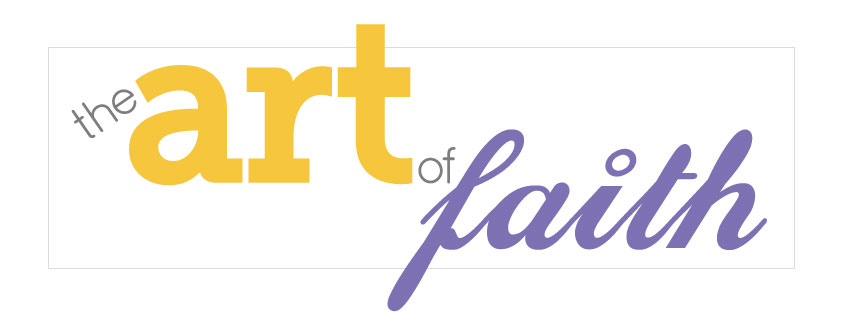
the Art of Faith Logo Final

There are a few minor tweaks that I would like to look into before this is the full final no return design, but these are so minor that they wouldn’t matter if they could not be used.

The next step on the design list is the website, once I had settled in on the Thursday I got the message that the corporate style site is more likely to be used and thus the designing of the website skin to go over the wire-frame had commenced.
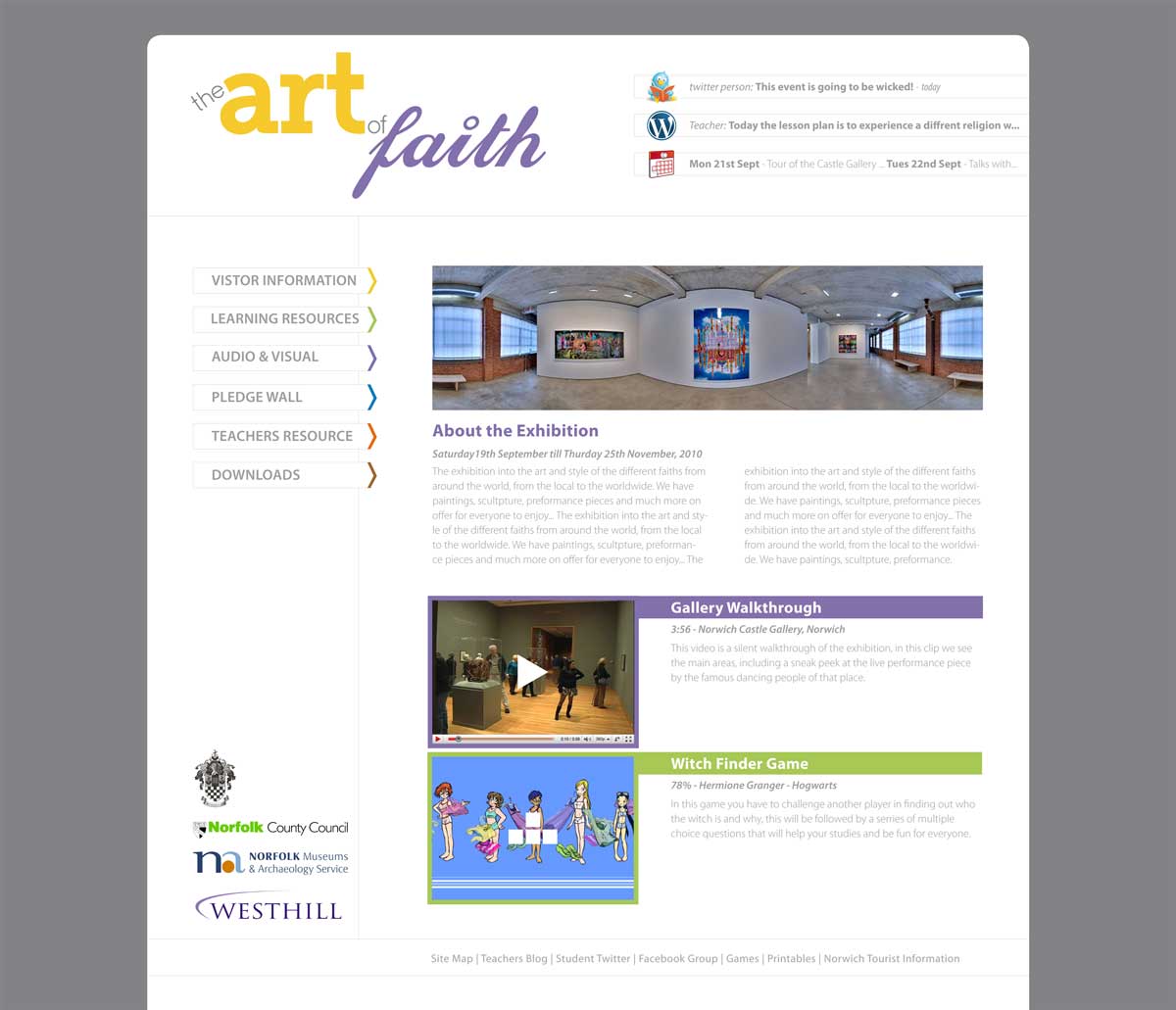
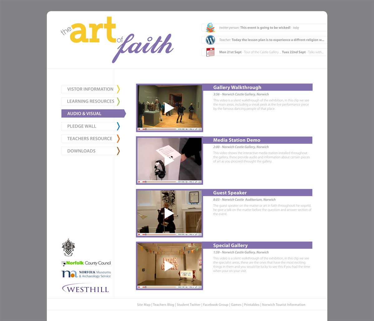
The idea was to keep the site as simple but functional as possible while not showing faith or make either of the users feel as if they should be on another site, for this I kept the white theme for the main site, applied a deep grey background so that the white area standout better and applied colour in minimal ways so that, when they are used they are the most dominant and thus easy to find, navigate and search through.

the Art of Faith Website - Home

the Art of Faith Website - Audio and Video

The little things that happen are; when you hover over a link in the navigation bar it reverses colours and become a focal point, by using the block colour and the extension, on each of the pages the items are highlighted in similar ways so that they can be identified as the right content, and when more of the pages are sorted out along the bottom of the site there could be a block swatch with all of the colours so that the user could also use these to navigate if they were familiar with the areas.

The initial feedback from the client has been positive and thus this Thursday will be creating the rest of the pages or tweaking the template so that the web developer can start on the coding. {updates to come}

Categories
The Creative Cakery

Drive with David Website – with images

To begin with this is more of an amendment than a new post, but editing a previous post seems counter productive considering I want to get this noticed.

Back in November 2009 I completed a website design and development for a driving instructor in Brighton, there was some problems and such like, as you’d assume with technology and a new set of skills; this led me to get the project signed off and it is now in the care of the owner, the site has changed slightly since my final design but nothing that makes the site any less functional.

The site that I completed looked like this:

Drive with David Home Page

Drive with David Instructor Page

Drive with David Lessons Page

Drive with David Useful sites Page

The design was set up so that all the information would be in direct view of the viewer, the scroll bar was not needed and this allowed me to play with old coding, as well as the newest to create a unique layout and style that is not like any of the other driving web sites. To see any updates or if you’re looking for an instructor visit http://www.drivewithdavid.co.uk/

Categories
The Creative Cakery

Typography

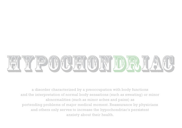
During a lazy day I decided to play with the font “Rosewood std” and see what I could do with it that was not carnival or similar, so I found some random words and type set them to explain what the word meant.

In the 2 version I have done it was relatively easy to do this but it wouldn’t always be like that in the task; either way have a look and see what you think.

Hydraulic in Rosewood Std

Hypochondriac in Rosewood Std