Categories
The Creative Cakery

an Archer with elegant Hairline follicles

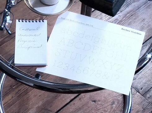
After completing a short type quiz on Pentagram’s website, I was told that my ideal font would be Archer Hairline, available form Hoefler and Frere-Jones. Like most people I hadn’t heard of this font before and was glad to have seen it because it is such an elegant font, and a font that I’d be delighted to use within some projects or to enhance my personal identity as an alternative font.

-The Typeface-

archer-screenshot

When you finish the quiz they present you with a type specimen so that you can see some of the characters along side that of the words you chose throughout the quiz, this allows you to see the font fully and ponder why that was the type chose for you.

archer_lightweights

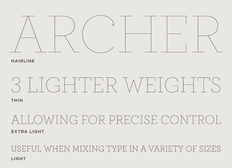
As you can see the font is beautiful, the carefully considered strokes set with elegant droplets on the end of the curvaceous letterforms that bring the strong straight lines a quirky nicety that would normally be overlooked by less talented typographers.

-My Favourite characters-

archer-characters


Personally I feel that these characters are the nicest out of the full font, they combine the nice curve letter forms with droplet tips with the strong dignified straights with the numerals that are so clearly defined and the glyphs that capture all that is unique about the font throughout. Only when you see the letters being used can you truly understand why this font is so nice, among all the possible weights available you can create a poster with striking headlines, a leaflet with clearly organised information, a billboard that emphasises the nano-niceties or just body copy where the subtle weights lift imagery of the page, this typeface is amazing to see and even more amazing to be compared to it, like so many other people I’m honoured.

Categories
The Creative Cakery

New Phone = Portable Media Station

Basically I took a big risk and eventually completed an upgrade, which to some people I know this will be a shock. But I’d worked out that if I don’t upgrade now its possible I never will, and that could be a big hindrance to me as a designer.

I, like most people looked around at the current market and found out that the phone of choice is, would you believe it – the iPhone. And I know from Kirsty that the battery life is shocking even on the newest model, so I wanted to find a phone that had a great spec for blogging, surfing, emails and messaging, as well as a fairly decent battery.

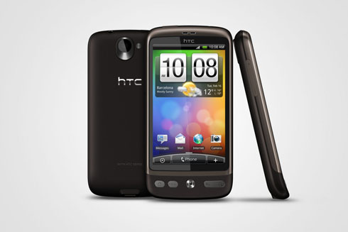
The phone that immediately caught my eye was the tattoo by HTC, a small powerful phone that had the things I wanted at a reasonable price, previews didn’t agree with this and I looked further till I discovered a review about a new phone coming to the market, the desire, a power house of a phone, these was great, better than great, so fantastic in fact they I had to actually go.in store and least have a look.

Long story short-er I jumped on the contract phone boat and upgraded from my Sony Ericsson W550i which has lasted 5 years and has been through the wars, it is now put to one side to peacefully live, the phone that in the end had a broken case lack of features they. Are now needed, but the best bit is they it is and was the best phone I have ever owned, the battery life is still up to 2 weeks on q full charge and it has done every thing I wanted it to.

-HTC Desire-

HTC Desire

I’m very pleased with the phone overall, it has the gadgets that I want, not the ones they most people have as I don’t really like Facebook or Twitter so I’ll never use the friends stream widget, but Twitter is becoming more bearable as time goes on.
The typing is easy and responsive, with a very clever predictive text function; the screen is a nice big bright responsive piece of kit, who I have not had any major problems with it, except it being maybe a bit too responsive when selecting items for.info and it selecting it properly. The internet is ultra fast and easy to.use in the same way that the iPhone is, the pages load quickly and when possible in mobile format which not only speeds up load time but the way in which I can get to the information I want, this is not a new feature but it is new to me.

Like all new smart internet email phones on the market, the battery life is appalling but manageable, I have been using a power saving widget to quickly turn off features that im not using to save as much power as possible; where the only problem this poses is that in direct sunlight the screen with no backlighting is not visible, with automatic lighting its only slightly visible and when you have full brightness the screen can be seen but not fully.

At the same price and with the same features, the HTC Desire is worth a look when selecting a new phone, especially a smart phone where it is going to be costing 30 pounds a month for 2 years.

{Update}

With the announcement of Froyo, which is Android 2.2 it has been rumoured that the Desire will be one of the first batch of smart phones to be updated on the dawn of the first official launch. Literally cannot wait, the speed boost, the flash integration and the java updates will be brilliant.

Categories
The Creative Cakery

A Moment Suspended in Time Private View

The private view had finally come, after weeks for planning and an amount of design work it has all come down to this big night; the private invites had been sent, the posters, flyers and emails had been sent out all to get the best attention possible for this night.

I have just come back from the  Castle Mall where the party is still going on; this being the actual private view and not the night out to celebrate party planned for this evening, or morning as it will become. On arrival; which happened to be 15minutes later than the official start, I was glad to see that not only was the place busy it was set up in a logical and thought out manner which enabled all persons to walk around the seemingly large open planned space with ease; something that smaller places should think about when organising art work for a show.

-The Show-
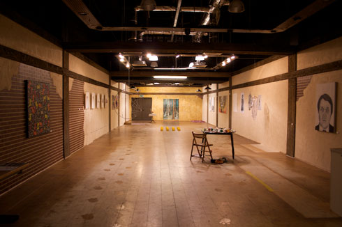
The Exhibition Space


Like always there are a few pieces of work that stand out and those that seemingly merge into their environments, a neither good or bad thing on either part; as both the previous statements can help to communicate the art work on show. Firstly you are greeted by the food, a strange concept by all accounts as this led to a lot of people loitering by the entrance eating food, even some that did not even enter the rest of the show, but this became a good place for it as it attracted the publics attention and appetite as they walked by.

To illustrate the layout I’ll give a run down from left to right then the central items.

Katie – Moo – Large Canvas painting with bright childlike colours ,on black in an illustrative manner.

Julianna– Faces – A series of paintings/ small reliefs depicting the sections of a human facial features, accompanied by a large hanging circle sectioned out in the same principles.

Ruth – Swirls – A set of paintings made up of vivid colours and textural items which would be seen around the home.

Kitty – Dead Things – Two part artefact consisting of a picnic blanket, basket and animal fur as well as a small decorated table with a candle and the complimentary hanging maggots from the table-cloth.

Debbie – Trees – Six panels depicting a seemingly simple woodland scene, but in amongst that there are a few hidden items.

Charli – Blood – On the floor you see a spread of hand-made blood cells; being made from wool, dough and cotton and accompanied by a letter from the blood donation people.

Josh – Head – Two portraits of a head, displayed in both Portrait and landscape orientations.

Ed – Large Canvas littered with stenciled lettering and ‘graffitti-like’ styling.

Sarah – Shirts – A series of studies into a shirt, an embossment, a casting, a dissected and photographed shirt hanging.

Amy – Portrait – A photo realistic monotone painting of a blind man’s face.

Kirsty – Cups – A huge selection of fabric cup and saucers arranged on a table that looks as if the worker has left the space as is.

Hollie-ann – Yellow food – A regimental set up of bright yellow bread like food that begins to mould, with a clear plastic box acting as captain.

Now that you know a basic layout of the space you can hopefully visualise the atmosphere that was around tonight; due to a few minor electrical problems a few of the lights at the front of the shop were not on, which did in the end help as this is where the nibbles were kept throughout the night, which not only allowed them to be cooler but kept the entire focus on the artwork. I cannot say any more about the show as a whole as this may stop more people from coming, spoilers an all; but I will say that it is a must see for anyone in and around the area for the next week or so, as there is a lot of talent show cased in this exhibition that will not only continue to grow but flourish as modern artists.

-Music-
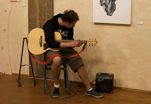
Charles

Once again we have been graced with an appearance by Charles, who also played at the Stew Gallery back in February; his selection of atmospheric melodies and tunes kept the exhibition space at a nice manageable level of ambiance throughout the 2ish hours I was there, ending on a song which was meant to be a classic sing-along but didn’t get off the ground with the remaining visitors. I’m hoping that he will continue to play at student private views as it would be a diabolical shame to replace such a talented performer.

-My favourite pieces-

In accordance with my normal view I will be mentioning the pieces of work of which I feel to be great for whatever reason.

Amy’s ‘Chris’ portrait is constructed to a high standard, much like her previous work (stew gallery). The painting itself is about 80x45cm rectangle on a chunky frame; the brush work is delicately constructed to enhance the striking image portrayed, a master piece of talent and style.

Debbie’s ‘Woodland Scene’ on six panels is not only beautifully painted but she has added in a few quirks for the viewer to notice, I have to admit that on the first few looks I hadn’t seen them, but once I had finally stood and looked at it they became apparent very quickly.

Hollieann’s ‘Bright Yellow Bread’, a choice that I do not normally make, it seems too modern and pretentious for me but it seemed to standout as being very good on the night; the grid like organisation coupled with the structure and colours made the work lift itself out of the bizarre bin and onto a platform of innovation, the bright yellow is very saturated compared to its surroundings, which helps its visibility and gives it extra credibility.

Julianna’s ‘Faces’ gained a lot of attention throughout the evening, and its partly to do with there being a massive gridded up ring hanging in the room and mainly because they are stunning paintings, more so the first 2 in the series as that have an elegant charm to them that is not only fantastic craftsman ship but details and styles that have been perfected.

The rest of the work has its charms but not something that I can get into, fabric cups, bright textural swirls and blood related work I have seen before (Stew Gallery), although these incarnations have been developed they don’t have the same level of style that I like to see.

-Overview-

The exhibition seems to be going well, with at least half the artists selling a piece of work or making contacts for later use, the private view went amazingly well despite the previous post’s comments although there is still an element of regret that further avenues of promotion had not been developed, and that a few of the designs had been changed for financial reason despite the style that was set up previously.

For more information on the exhibition visit: amomentsuspendedintime.wordpress.com or even better visit the gallery space in Castle Mall Norwich, Second Floor, next to Rymans Stationers.
Categories
The Creative Cakery

iStat Menus Version 3

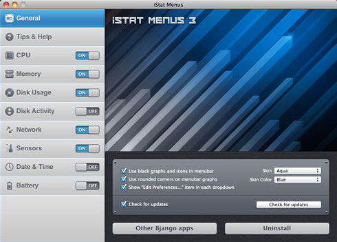
iStat Menus-General

Finally the new update to that handy piece of software is out and this time you, have to pay, so like most people I will stick to version 2 and not get the network working on my new Macbook; or this is what I though when I first heard about iStat now charging; seeing as the pop up has happened a few times since the release of V3 I have thought about upgrading to it, mainly because the network function of this software was the reason for downloading it in the first place only to find that it does not work on my new MacBook, and because I feel that I want to give something to the developers who took time to create this really quite handy and functional software.

If you have paid a lot of money for a new Mac then you already know that you want to look after it, keep it in full working order and if there should be a problem you would want it fixed asap, so with this application you can quickly see if there are any under lying problems that may cause your computer to not be working fully; this could be one of the dual cores not working in hot conditions, a fan over spinning, the disk drive overheating and so on, and I feel that I would rather know what is happening than wait for something major, which can stop my work flow.

-Paid apps, are you kidding?!-

Like most people I love free software, so the recent development to the iStat menu telling me that it is now paid didn’t go down well, as I have been waiting for an update to fix the network problem on my new MacBook. Alas the update came with a price, this time literally, the software is now 10USD for a single license and it gives a new cleaner, and easier to use interface which compliments a lot of their other work, seeing as they are developers for the iPhone and Mac, I told myself over and over agin that the update was not that important but I couldn’t hold out, so I went ahead and brought the upgrade.

The upgrade is as nice as I thought it would be plus extra, the interface is really easy to use and very nice to look at, not that is a reason to spend money on this app, along with helping out the developers I feel that this was money well spent, I now get tech support, updates till a new major update i assume, or they could be really nice and give updates forever now that I have paid for it, either way I now have the upgrade and I love it.

If you need the update to get the network working on your Mac then I would highly recommend this to you without hesitation, so go to the preferences menu, click ‘check for update’ > get it now > install > buy > be happy :D, Easy.

If you have never even tried the free version up till now, then your missing out (assuming that you like to know whats happening with your mac, which I do, seeing as it costs rather a lot to not notice that the heat sink might be overheating), so www [dot] it over to: Bjango

While you wait, check out these screenshots:

Categories
The Creative Cakery

CS5 64-Bit???

I have just installed the trial for this new piece of kit, and being curious I decided to have a look in activity monitor to see what was happening in the background only to find out that the only program out of the 5 main programs running in Intel 64-bit was Photoshop, all of the other programs were still in the 32-bit seen in the previous versions. Now either I have heard wrong and Photoshop is the ONLY 64-bit program or there is something not right at Adobe.

{update} or possibly because this is a trial they have only shown PS in 64-Bit to illustrate the difference between the software, before the final release; if so I do not remember them making this clear, and if I was right to believe that they ‘Could’ Be duping the consumer by selling the products as 64-bit, while only giving them PS in this format.

Categories
The Creative Cakery

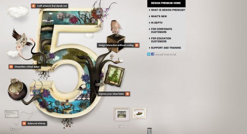
To Buy or Not to Buy CS5

screen-shot-2010-05-01-at-23-51-55-e1272761466676

Firstly id like to say that I had been very skeptical about the newest release of the Creative Suite as it hasn’t been that long since I brought CS4, which for me was a brilliant upgrade from 3 and 3million times better than 2, all of which I have brought, I know, mental for a student right…

I have been following the updates of the software and I decided to follow the live event that introduces it; and within minutes I was very impressed by some of the new features that not only allow you to be quicker but allow you to do more, with ease. Now I haven’t actually tried it yet and thus can’t tell for sure that it will be a lot better but the trial will be downloaded as soon as and test run before the official launch.

-To Buy-

Photoshop with a very quick and easy to use 3D features that can be a great stepping stone if you don’t know 3D design, or cannot learn it.

Photoshop with intelligent background input, where you can take a normal image, crop out an element but have PS fill in the now empty space with actual background that wasnt present on the file.

Illustrator that allows you to align dashed strokes to corners.

Illustrator that allows you to control the weight of a specific point of a stroke.

InDesign that gives you multiple sized pages in the same file.

InDesign that gives you multiple media with in the program and with present animations that are straight from the code of Flash.

Flash Catalyst is a new program which I have trialed before, the ease of design with all the functionality of coders.

Native 64-bit architecture, which improves the overall performance of the software on most new-ish machines. (which run 64-bit and have sufficient hardware capabilities)

-Not to Buy-

A lot of the new features are really good and could come in handy overall; but with the price increase and the features being very minor for me are the pros better than these cons?…

The price increase is not by a little, but by a fairly big amount; CS2 cost me £180, CS3 cost me £235, CS4 cost me £225, CS5 is £336, so is it worth the increase of a cool one hundred?…possibly!

The features are, and will be very good, but I somewhat feel that they would be novelty rather than productive, I don’t use Photoshop that much to take advantage of the new features, I don’t even edit my photos in Photoshop, I use the impressive features of Aperture 3 for minor colour adjustments. Most of the new features with in the 2 main programs that I use are minor compared to the expense, different size pages in ID is a great, while the stroke options are fantastic, I have only needed this function on 2 occasions where I over come them by creating a new document with ease.

Also I do know Dreamweaver but since working in a Web Development agency I have begun to use the phenomenal power of the Visual Studio Collection from Microsoft, namely Visual Web Developer 2008 Express (as it was free.)

-Verdict-

Adobe CS5 Popular Products

If the features work well, and the speed is actually improved on my computers (as all current tests are only averages by a select amount of, slightly, biased companies) I can see a real incentive to upgrade once again. But I will not make my final verdict till I have installed the trials and tested them out for myself.

Categories
The Creative Cakery

Student Exhibition in Castle Mall, Norwich

Recently I completed the identity and promotions for an upcoming exhibition, the way in which I tackled this was slightly different to normal projects that I have worked on, which was because Kirsty told me that I should do it for them and seeing as she seemed to be leading the exhibition I decided to do it.

To start with the title was one of those titles that evoke a certain image and that is usually the one that you end up seeing, this one happen to be clocks, as decided by the group as that. The most logical imagery that would be used, and being me I didn’t want to do that. So I started off looking at other time related images that could give a nice image to play with.

These consisted of diving, running and generally any sort of action sport that would give a provocative photograph; the ideas continued before I decided that the best way to represent the title was through the way in which he audience will receive it. A Moment Suspended in Time; to me sounded like a pause, so I came up with a few concepts to show the group and they really liked the flyer that gave the title in 3 stages.

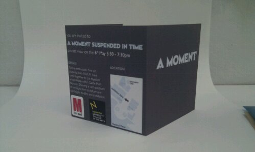
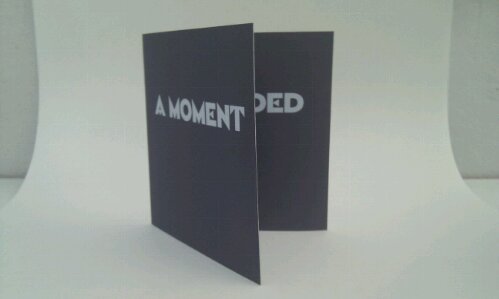
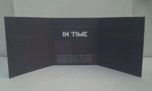
Below I have taken a few quick shots of what the flyer (in this case the private view invite) looked like once I had printed a Master copy, the whole piece was considered down to the stock (Epson Double Sided Matte, Coated, 178gsm) but in the end the actual flyers were bulk printed in black and white which meant that a lot of the style was lost, but the main identity was kept perfectly.

image

image

image

The images above show you what the design should have looked like if they had been properly printed out, but for them they decided to save money and do it at Uni where the colour laser printer was printing out the block grey background in stripes of blue and green, so we had to printed them out on the Black & White printer to get a reasonable quality as they are being handed out. These Invites are designed in the same way to the flyers so that the title can stay as a broken up title and thus keep the identity of the exhibition; where it was shown on one face the type was split up onto 3 lines with 3times leading so that there was a big gap between the words and thus keep the identity going even thought the media inhibited it.

There are a few problems with the overall exhibition, these being:

Lack of communication between ALL group members.

Lack of Finances, or lack of wanting to pay for anything.

Not compromising for the good of the exhibition.

Which leads tot he fact that, A – the T-Shirts are white with grey text and made with iron on transfers (not my advice or design, the final one was taken from the poster and adapted for the t-shirts by a group member), B – the exhibition layout is pretty much destroyed by the fact that certain people will not budge on favourite positions, which would not only make sense but make the overall feel of the place better, and finally, C – the lack of overall support by ALL members has created a stressful and somewhat un-workable atmosphere between some of the members.

On the whole I feel that the exhibition will run smoothly and there will be a lot of press to accompany it throughout the showing, if you want to find out more (well not so much more, as the blog is not being updated as much as it should be in favour of Facebook chats and status updates.) but a place where you can see more at least about the artist themselves.

A Moment Suspended in Time Blog

Categories
The Creative Cakery

Void of Design

-Reasoning-

I know that a lot of people will look at this page thinking that there will not be anything worth looking at due to the title, this is basically because the literal meaning of this blog is ‘Lack of Design’ or the version that I use is that in the world there is a void where good design should be, a hole in the world in which I will fill this need for good design, thus the -Void of Design- is here.

Through the criticism of this title I have looked into the sort of web presence I could have; this is because I feel that having a similar name to that of other designers could and probably will be confusing in the long run, my name was obviously the first place to start when looking in to this, and with a name like mine, the limits have been reached, the tag that I used to use {ReKreate Design} is also taken in many forms and so I looked into alternatives, when I can up with the current Void of Design. Now that I have chosen my identity I felt that I would scope out how id seem online; this led me to discovering 4 design websites at the top of Google with similar names, annoyed to find this out I looked into the sites and a sigh of relieve shot right across me as I found out that one of the sites seems to be a linking site and nothing to do with design, another being a design site but very bad and annoying for anyone to navigate and the other 2 are equally bad.

In order:

-The Void-

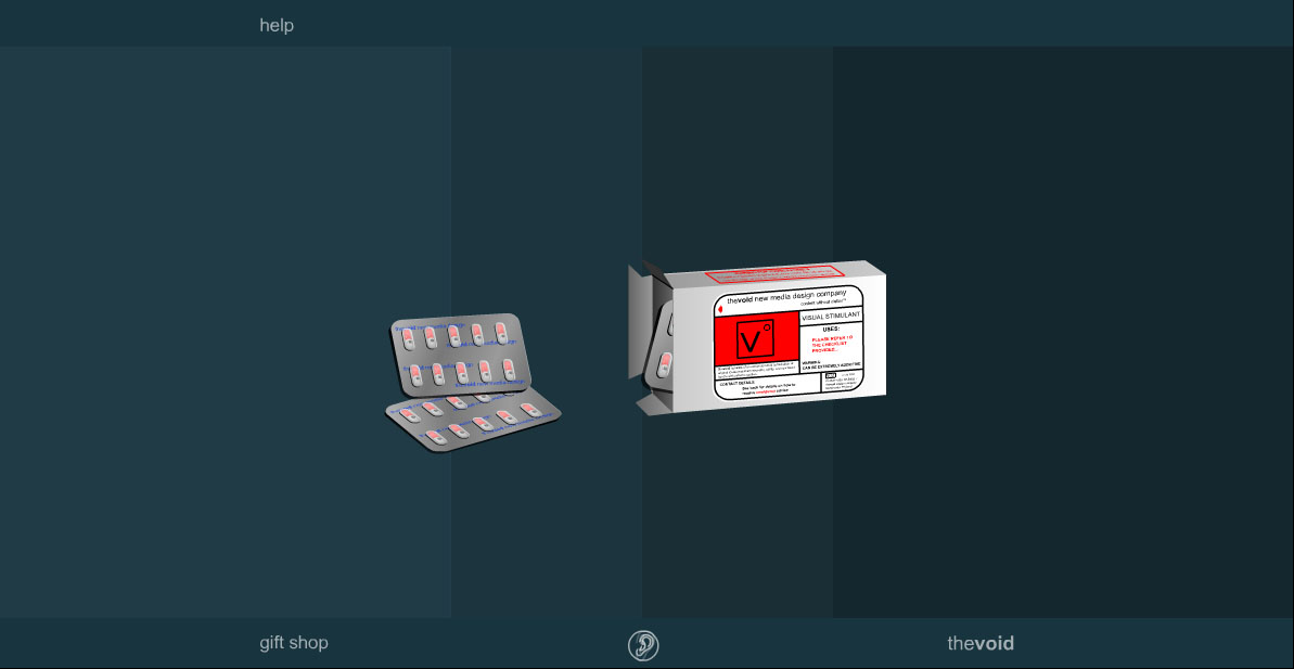
the void home

This website appears at the top of the google search and is a design company based in Manchester, the site is flash and the menu is the box of pills; like most people I don’t understand why this is and what the point is. The whole time you are on the site there is music playing in the background which after a few seconds becomes annoying, the site seems like it was created on a whim and without any ‘Real’ thought as to what the idea was, and coming from a company advertising that they are digital creatives this seems to be hype and no-show. -link

-Void Design-

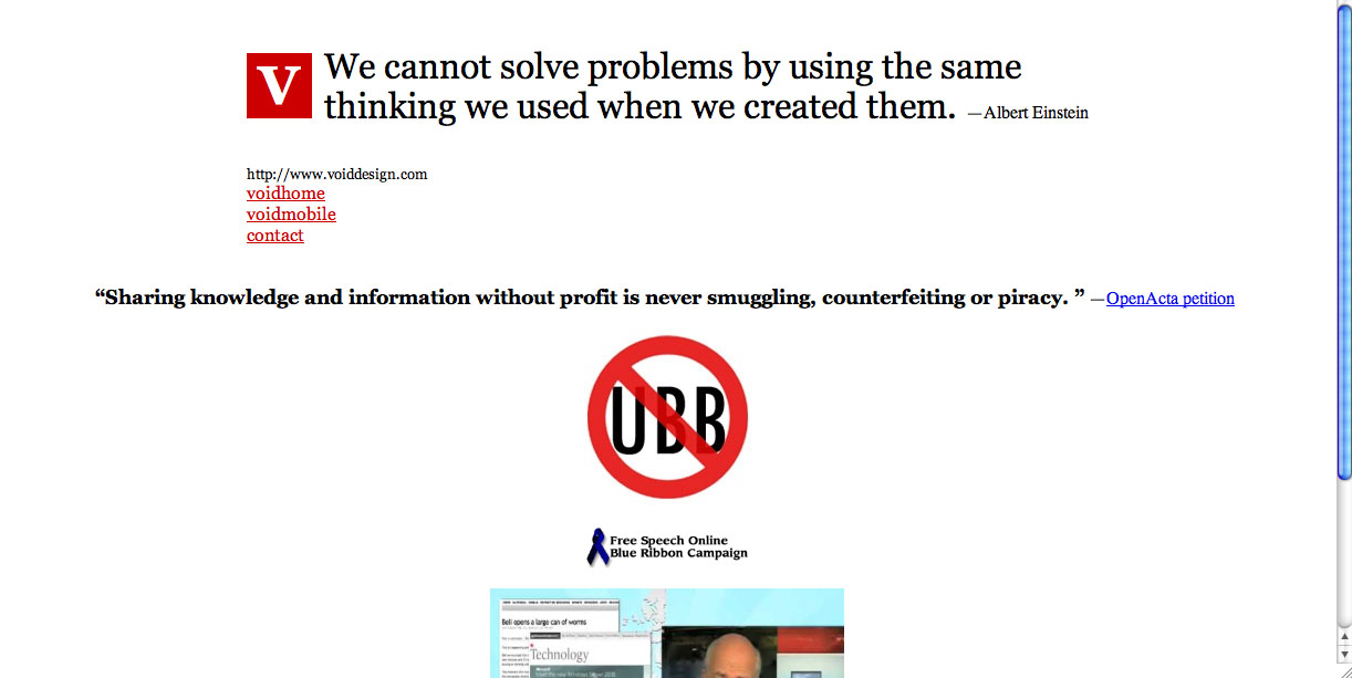
void design

This website is a disgrace to even have the word ‘design’ in the title, the page looks to be a holding page for all the unrelated links that it has to distribute; on this page you have a quote as a header, which is to do with design but not about why they are online using the title, and has a lot of info about free speech, dreadful design. -link

-Design Void-

Design Void

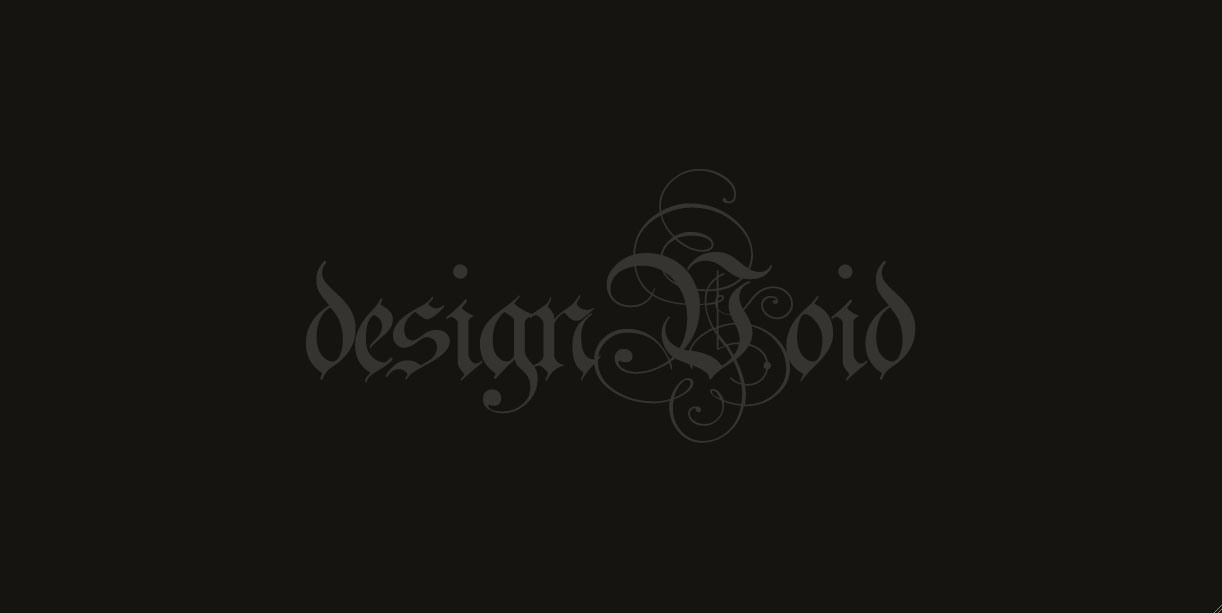
A home page that is exactly that, a page with nothing else, and no indication that they are building a site or if they intend to, so there really isn’t much to say on this page, a very Gothic typeface set in a deep grey on black is standard, basic and a waste of time and money as seen. -link

-Void-Design-

void-design

A better site than the one previously mentioned as it actually has some information on it, the site is “under construction” and I hope that it has something to do with design and not another one of those linking sites. -link

-Summary-

From this I can keep my online identity name going and have a websites that is not in the design realm, par se but will get noticed in amongst this bunch of ‘sites’ if we can say that with full honestly; which I cannot, I don’t want to seem that I am slandering the other sites because they happen to be in the area of the web of which I will inhabit, but I do truly feel that the sites here, are and will be dreadful and that my site, once designed will be at least 60% better to most people and 300% for creatives when they are looking for someone with the skill in which I posses.

Holding my design head high I can continue with ‘the plan’ and hopefully you will see a lot more work on the web by me, and in the streets. (if you live in Norfolk)

Categories
The Creative Cakery

the Jane Austin centre, Typography?

the Jane Austin Centre

A simple promotional leaflet for the Jane Austin Centre, hmmm I’m not so sure of that. While away I was looking around the tourist information centre and picked up a lot of leaflets of things to do in and around the Bath area, but this leaflet was ~not~ picked up for that reason; I picked this up because of the logo type.

Being a designer, especially one who loves, but doesn’t design type find myself looking at this and questioning the reason behind one specific detail: the placement of the initial word ‘The’ in relation to the rest of the type. Like most people I find the letter ‘J’ in either form, a nuisance as it has both an ascender and a descender, because you would not set it to the top of the x-height as the descender would be too long; whereas the bottom of the letter being on the baseline would be absurd as that just looks horrible from a typographical approach; and in this case the uppercase ‘J’ causes the ‘the’ to not be aligned to the left of the overall type, but left to be closer to the serif of the ‘J’ and not centered between the 2 capitalised letters.

The layout intrigues me, the reason behind its layout is baffling to me yet I still like their decision to do so, the central approach would give the letters a lot of blank space to float in, the left aligned above approach would make it look uneasy, so for those reasons I love this logo, the vector graphic set in that old style of cameos, the simple clean serif font (don’t particularly recognise it) for the name and the combination of the serif and sans-serif is a technique that I really feel that people should do more when applicable to the cause.

If anyone has any thought on this matter, please let me know, or even better – if you are the designer I’d love to hear from you about the placement.

Categories
The Creative Cakery

Fish and Chips Leaflet

A design query rather than the food.

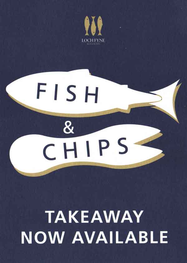
While in Bath we walked past a Loch Fyne Restaurant where they had a promotional leaflet outside which caught my eye, mainly because it was lunch time & I was hungry but also because of the way in which the imagery had been portrayed and captioned.

Loch Fynes

My query is that the image of a fish is shown as a simple vector of a typical looking fish, which in this situations looks and feels fine, but it’s when you see the chips image they give you the shape of a chip fork; not a chip but the utensil that you use to eat one if you don’t like to eat with your fingers. (which I do, the best part about chips are that they are a ‘finger food’)

If we look at it from the other way round the query is still there and I still don’t get it, the chip fork represents the way in which you would eat chips from a take away, but the fish doesn’t show the way in which you should eat a take away fish; how does this imagery work, how the 2 images work together I don’t fully know. To top it off they have the descriptions of the service written on the items themselves, not either the image conveys the message or the words convey the message, why would you need both the type and images to get across the idea that they do Fish and Chips at a fish restaurant?!