Categories
The Creative Cakery

Norwich Architecture Book is coming out of storage

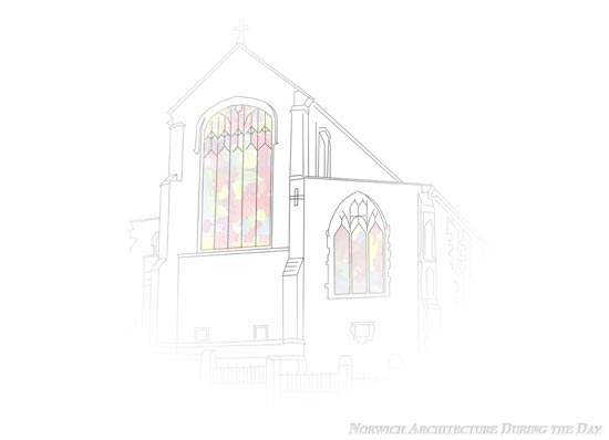
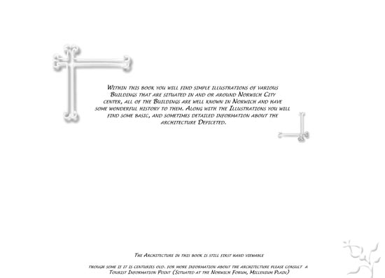
Way back during my A-Level Graphic Design days I came up with a self initiated project which was made up of 2 book that were to showcase Norwich; called “Norwich Architecture During the Day” and “Norwich Nightlife”. Both of which went through a lot of designing and led me to scrap the nightlife book so that I could concentrate on the architecture book, as this had a better idea and interested me a lot more as Architecture was my degree of choice before I found out about the cost and chances of that happening. The initial idea of the book was to just have pictures of the architecture then have the book look old and such like, more style over substance; this then turned into a larger project, a poster, badges and the book were my finals back in the first year of my A-Level.

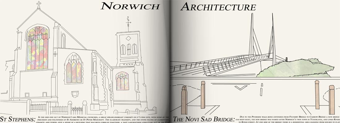
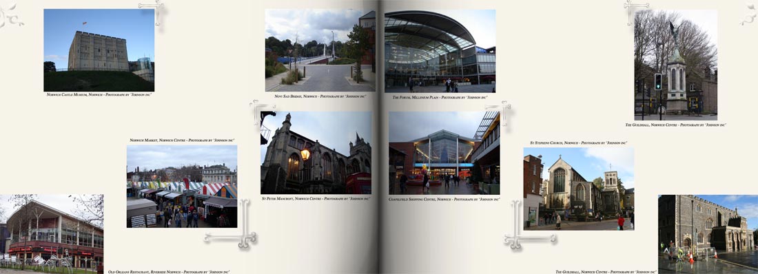
As it had always interested me and that I really loved working on the project I brought it back to life in a ‘what else do you do week’ in the first term, back in October 2009. This led me towards taking new photographs where needed, and creating illustrations from them which accompanies a small description of the architecture depicted, but due to the degree that I have now finished I was able to set up a template for the book, which made the information standout as much as the illustrations which are still ongoing.

-The Old Version-
Old Cover


Just so you know, the text going up to the edges of the pages is not a web formatting problem but how I had actually designed the pages, and yes I know it is really bad typography, layout but a really nice concept and idea that I have been trying to get right recently. By taking the photographs again I can control the full look if the new design properly; the illustrations come straight from the photos and I take a lot of time getting all the details right as to do the historic architecture justice as well as give credit to the contemporary architecture.
As most people have not seen the architecture book I’ll leave this post for you to look at and hopefully comment on, the new versions will be posted soon.

Categories
The Creative Cakery

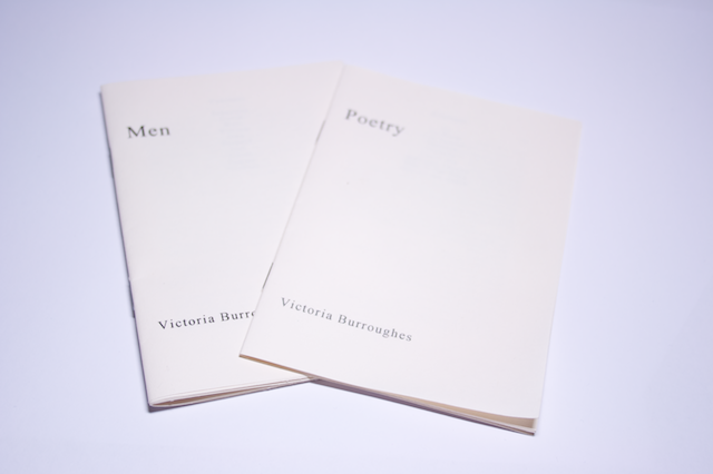
Two small stapled books on textured cream

Recently I brought some literature books hand-made by Victoria Burroughes, a student on Ba Visual Studies, at the Norwich University College of the Arts. These being the newest lot of literature that I have read from her it was a refreshment of the style of writing that she has; in some cases the poems are short and snappy, on the other hand she gives the reader a lot to think about whether it be a simple statement that we all feel or a narrative about the mundane journeys that we all will inevitably take at some point.

The Books

Poetry Books

Both books are designed in the same format and with the same feel and quality, a simple soft textured cream paper that makes all of the words standout in either black or deep grey. Design overall from my point of view; in order, the covers are controlled simplicity, a medium weight serif in two sizes with a lot of space to give the desired hierarchy. The contents page and copyright at the end of the book take the centred style, which to me seems a little strange seeing as the whole book is left aligned most of the time, even when the main body copy is justified in ‘Men’; the margins are set to a document, where the outside margins are the same but the inside margin seems to change which is probably due to the way in which the pages have been printed and bound together, which is understandable in this case. Other than the few pointed out design related mentions the book flows beautifully throughout, with little or not qualms or oddities.


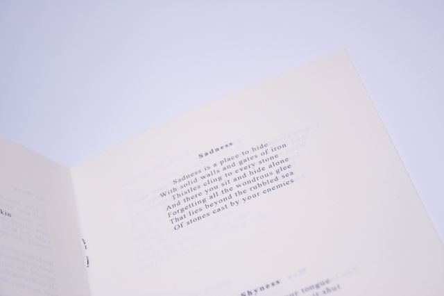
“Poetry” Snippet

Poetry Book - Poetry

Nine poems that capture a moment in time, a simple statement about a friend, a journey or an injury. The words are both powerful and subtle, simple and complex the feeling that her life is like her poems, the feeling that a monologue is created just to imagine the events and situations happening, that omniscient listener to a souls thoughts throughout her life, captured in a few lines carefully constructed to maximise the impact that it has on the reader. Above the realism of all the events hinders the humorous undertones that give us hope of something better, happier.


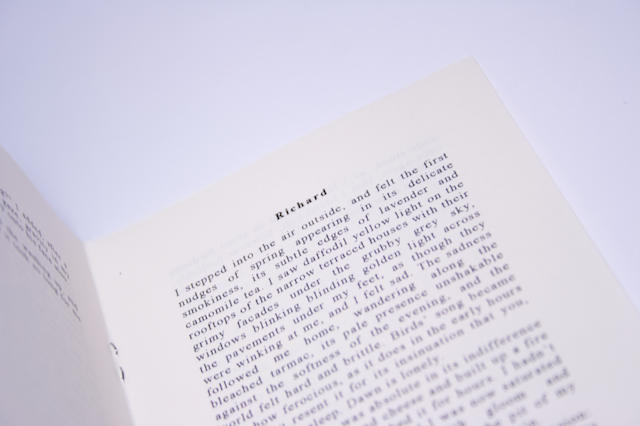
“Men” Snippet

Poetry Book - Men

This book is the bigger of the two and is a collection of first person accounts of 10 different men in her life, portrayed with specific attributes to give the stories density in such a small space. For those who love to read about other people, the feeling of looking into someone else’s life, the big brother style fans that just watch people and in the end want to see what happens, the high lows and feelings felt by someone else without knowing the actual people behind the perceived, if you are that person then this book is your friend. Through the thoughts of a friend, lover and acquaintance you get an uneasy impression of her life, and in some cases a strange feeling that you are her, a puppet thought the eyes that you look, a beating heart of a hidden romance and the sadness that follows, whether it be an emotional tie to the stories of a memory that seems so real that your life has the same situations that seem even more real by reading the similarities.

I highly recommend these books to everyone for all the comments written above, you cannot help but be moved by at least one of the poems and equally so by one of the stories in Men.


Books Copyright Victoria Burroughes, Found at: victoriaburrougheswriting | victoriaburroughes, and can be brought directly from her, just email, or through Etsy.com

Categories
The Creative Cakery

“Your Graphic Goes Here”

The other week while walking the normal to and from of University, that being before I graduated, i noticed that the sound on the TV had become distorted, and when I looked up this is what I saw, a badly typed and rendered advert that was advertising and advert space available on the TV, now I personally find it ironic. If you cannot see the video, here is a brief description; In amongst a news report you had the advert flickering in and out of sync which reads “Your graphic goes here”, this being in large plain lettering and highly pixellated interrupting the news.

Although not informational or educational it was a curious find that had to be captured.

Categories
The Creative Cakery

WordPress Blog Optimisation

http://www.admixweb.com

Not a post from me but a brilliant post on http://www.admixweb.com, not only do they suggest brilliant plugins that work straight away but help you to understand how to make your blog load up faster over time. Seeing as I use a self hosted blog it is always a challenge to make sure that the blog is showing up correctly on all the different devices as possible as well as making sure that people can access it as quickly as possible to maintain the hit rates, as we all know that a slow load up time can cause the public to give up and look elsewhere for the info they were searching for, a reader that might never come back.

If you have any more suggestions about speeding up a WordPress blog, post in the comments of either site.

Categories
The Creative Cakery

Aggro Santos.com mimics a stack of newspapers

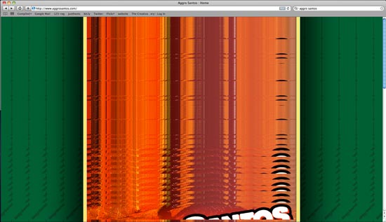
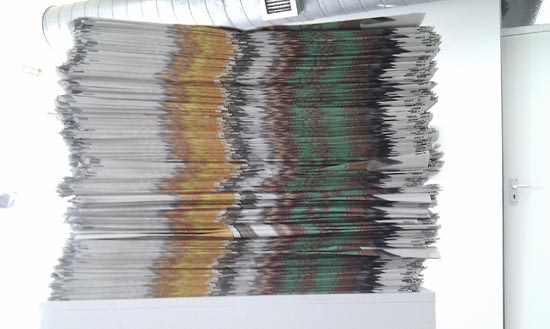
Upon finding out who was responsible for Candy, a song that is on the radio a lot recently in the morning, i decided to Google them to find out more. As soon as i had typed in the name to Google everything went funny, firstly Google seemed to crash and never load up the website, then i managed to get it to load up but it went really weird if you tried to click or move the mouse.

-Comparing it to Newspapers-

So as you can see this is very similar to our Racing Gold Fish Newspapers, similar colours and style, a great glitch to come across, creative in its own world.

Have you had a website glitch up like this before? if so leave a screenshot in the comments.

Categories
The Creative Cakery

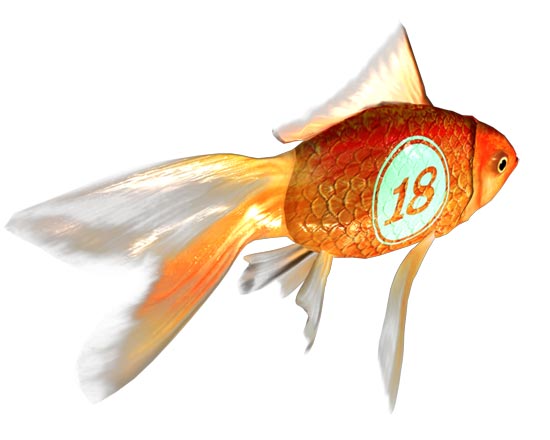
Racing Gold Fish

racinggoldfish18

Finally, the preparation and the dedication (from certain groups) has paid off as yesterday showed. In the afternoon we saw a private view for industry and specially invited people explore the wonders of the annual NUCA end of year shows; followed later on by the general private view for family friends and anyone who wants to come in to either look at the work on show or as you might expect, have some free drinks on the students.

This year has been very different to that of previous years as our exhibition has been re designed to be a lot more open and bright, plus the added bonus of being a lot more eco-friendly due to all the work being hung on paper rather than foam boards, like the other courses. Overall the exhibition was a great success with a few people getting offers, either on print work or for jobs; which at this time is a valuable aid for all the students at the moment.

The main thing that I have taken away from the end of year show is that if you know something that isn’t necessarily on show it will come back to you when you have a great selection of friends, word of mouth gets more attention than a business card, well not all the time but it has worked for me thanks to Mark Amos @foliosoul, Chris Elms @chris_csp and Kerry Armstrong @armstrong_gcd to name just a few.

To find out more about the Designers on show visit Racinggoldfish.co.uk as the main portal, or should that be fish tank?!

If you’re a design agency then you might want to visit out D&AD stand as there is a Biorb Fish Tank being given away in our newspaper, Stand 40.

{all the fish were designed by Leigh Evans at Norwich University College of the Arts}

Categories
The Creative Cakery

A Lemon Light for Nostalgia

For those who have not seen the video, watch it, not in a minute, in a second, or even just hang on, Now! – Might not work for iPhone users.

I have heard the song nearly 3 times per journey to and from Norwich on  a daily basis and wanted to see if they had a video, and I was amazed at how charming it is; basically a guy sits at a strange piano thing and the room filled with nostalgia starts to move, and this is the charming bit, because we are so used to the charts being filled with Hip Hop, Dance Tech-no songs (some could not be classed as such in my opinion) about girls, sex, money and such like so this for me is a great change from this. Even if you do not like the song (hard to not like it, so catchy) the video is brilliant, shot in a single room with no visual effects, other than those created by the toys as they wander around the room. It’s nice to see the likes of Brum, Type & Speak, Robots, and my favourite a Lemon Light.

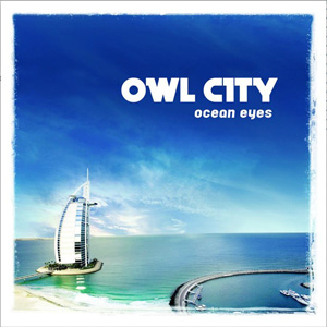
If your looking for nice clean design Owl City does not disappoint, as the CD cover is very nice, a picture postcard style that captures the melo, tech-no feel of the music and lyrics throughout the album (based on Fireflies I brought the album, which included the video.)

Owl City - Ocean Eyes

I will not pretend that I’ll deconstruct the design or even the video, because that is not why I have posted it, I heard the song, loved it straight away and really like everything about the album, design, style and Rhythm.

Categories
The Creative Cakery

For those who want to play

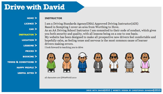
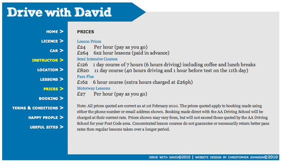
A while ago I designed and build a website for a driving instructor in Brighton, on the South Coast, but due to technical problems that I could not do it was pulled and a not so nice design of a site was then put up because it has the needed functions. This will have caused a few people to be directed from my blog to the new design, based on template software and not my design; but thankfully I have the files still and for those who would like to see it in action can.

Follow this link to a working version. Driving is Fun! (Screenshots below to jog your memory as to the design)

and for those who may not know this is the logo, in the top left corner actually links to a short animation that I initially pegged for the website, Flash was meant to be the best platform to design websites on, but I quickly decided that coding was a better way to do it and thus a snippet of the original flash site is not an ‘Easter Egg’ of sorts for those who know.

{All prices and contact details were correct at time of designing, so if you are in the South and require Driving lessons, I’d highly recommend him.}

Categories
The Creative Cakery

the New Identity, a welcome new start

Website Home page

To start with I’d just like to say, Welcome to the new blog, a place where the “void of design” days are over and where the cakes are in. As you might know the new identity is “The Creative Cakery”, but don’t be fooled into thinking that I make, design, sell or eat cakes all day, because only some of that is true, the main reason for this new identity is to showcase my designs in a more positive light, plus I get to make more cakes and call it research :).

At the moment I am in the process of Designing and building my website as well as getting my stationary finished, the website will be going live soon, where I hope that there are a few bored/ interested people to help me in the first week to debug any of the problems that may occur. The website will hopefully be very easy to navigate as well as interest anyone who maybe looking at it; this will include people looking for cakes, which I do make, but are shown on my Flickr account.

Categories
The Creative Cakery

Adobe Creative Suite 5 *review*

It’s nearly time for my trial to run out, and to begin with I’d just like to say that I haven’t used the programs that much since installing them, this is due to me not wanting to down save every time I use it especially seeing as no one else is using it enough for me to get all the benefits from them at the moment but from my point of view id just like to sum up some of the programs.

-Programs I use-

indesign

InDesign: The main new feature that I was excited about was that of the multiple pages sizes with in the same file, this meant that you could have all the files for a document together, the compliments slip, business card, letterhead and the guidelines together etc. The other thing about this is not so good, this being that although you can have different page sizes, it could get confusing for other people to know this, especially if you take it to a printer as a pdf, say in some a4 and some a3, all landscape, there is a slight chance that they could scale to fit the first page and apply to all, causing you to get your document scaled down or up respectively. Now I’m not saying that will happen or that there isn’t a way around it that I haven’t seen in this trial yet, but it’s definitely something to think about.

Although it’s not that interesting, you can now control the images that are in placeholders a lot better, for a stat you can select the image or the placeholder with just the one click, and you can then scale proportionally using the same keys as illustrator, hold shift+alt+command while scaling an image will now scale from the central point, which is something that I have wanted for a while now. Finally there is the Gap tool that allows you to keep a gutter between 2 images the same while you change the size of one of the images, this allows for greater control over layout and position, that is a good feature, but not something that I use.
illustrator

Illustrator: A few new features that are very interesting and could potentially be very useful overall; the variable width stroke tool, and the shape selector are the 2 tools of use. I have never tried to edit a strokes width in the same way that this tool can help but I feel that there will be a use for it later on, with regards to the shape selector it is a god send as this is something that I could have done with on numerous occasions, with overlapping shapes you can selected areas that you want to turn them into new shapes, handy when you have layered vector graphics and/ or a complex shape that you want to use as a placeholder. These improvements are fairly minor compared to the ones that were introduced in CS4, especially that of the multiple art boards, which over the last year have come in very handy on almost all of my projects, except when you have to version up all ideas for a client.
photoshopPhotoshop: Apart from being the only 64-bit application in the Design Premium set it does boast very cool 3D tools that will come in handy later on but not something that I feel is useful in the long run. Basically, this update was about speed and improvements on the existing features rather than introducing new tools, the overall speed of the program is very quick, even on my 4 and a half-year old iMac, running the base processor but with upgraded ram. All of the new 3D tools work really well, the ability to create native 3D objects from a flat graphic inside Photoshop is pretty amazing, especially if you need to quickly mock-up a box and you don’t know/ have 3D software.

dreamweaverDreamweaver: When I was begging to start the build my website I decided that I’d use Visual Studio as it was the program that a few of the companies that I have worked at used, but with this new installment of Dreamweaver, it’s better, the 3 features that make it so are: Live Code, Live View and Inspect all of which are the tools that I have had to use in Firefox as extensions. Inspect allows you to see the code, next to the visual website, but when you hover over an element you get to see all the properties for it, such as the margins, padding, size of area and layout, all of which are key to building a fully functioning website. In my trial version I have noticed that when you undo a few actions, it is prone to crashing, I don’t know why but it has happened a few times on me, luckily I had nothing to lose but it can be a bit of a pain after a few times.

flashFlash: The one program that I have yet to use that I normally do use, this is due to not having a project that requires Flash at the moment. From what I have seen it has been tweaking of original tools, making them work better, more streamlined, better integration and such like. But by far the best addition to this is the iPhone App export, this enables you to build an application in flash but export it as an iPhone native application, this includes the original swf files along with a xml file, this will be one of the best tools of this version due to the fact that a lot more people can get on board with iPhone and build apps a lot easier than learning about xcode.

-Programs I don’t use-
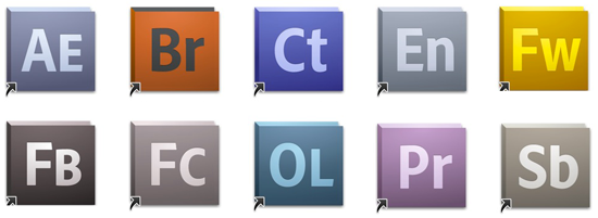
cs5 logos

These programs have only had a slight look in during the trial, that being that I don’t really need them but they have there uses, the furthest that I got with any one of the programs is that of SoundBooth, I imported some media, edited it, cropped it, added some stuff to it, and in the end I had a sound wave that was mainly just noise. After Effects I have used briefly during a tutorial about how good it was, but I have not looked into this version and probably could not see what the differences would be if I saw them. For those who are not familiar with the icons they are (from left to right, top to bottom):

After Effects: Animation | Bridge: File Management | Contribute: Website and Blog Management | Encore: Unsure | Fireworks: Photoshop and Illustrator Hybrid | Flash Builder: Build applications | Flash Catalyst: Illustration to animation | Onlocation: Video/ photography | Premiere: Video | Soundbooth: Multimedia Sound.

As a review it is very basic and possibly not that useful for those who have a had a play with CS5 so far, but for those thinking about the upgrade, then these are the best words I can think of to sum up an upgrade: If you currently have CS4 then the improvements aren’t that good overall, the 64-bit Photoshop is good but not worth a full upgrade. CS3 its a must have, all the best features of 4 with a few additions makes the 3-5 jump very wise.

The bits to watch out for are that CS5 will only work on an Intel Processor, with a fairly high spec, as I said before im running a 4 and a half-year old white iMac, 2.16 Processor | 4gb Ram | 50% free Hard drive and it works very smoothly, so anyone with a similar spec or higher is laughing, as always it does depend on what features you need and what you can afford that chooses the outcome.

To find out more, visit Adobe’s CS5 website.