Categories
The Creative Cakery

Poetry+Clinic

Today is the first run of the Poetry Clinic here at the Norwich University College of the Arts, a scheme that gets people involved with other courses and to enhance peoples literacy skills.

Summary

As you walk through the door you are greeted with a messy, studio filled with objects that have been collected, in the far corner there is a fellow student dress up like a typical secretary, with laptop, filing tray and the standard grey folders that have the doctors notes in. As you sit there filling in the very brief form you can hear the doctor with patients as there is not a door between the waiting area, the place with a few red chairs that promote you to sit up straight, for fear of back injury.

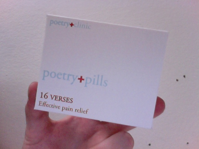
Once you are called up you go into the doctor’s room and start to explain your symptoms, real or made up and the doctor will talk to you about things so that there is a diagnostic so that the specific medical treatment can be applied, in my case these were “Poetry Pills” which contained 2 short poems which are charming and somewhat enlightening.

Poetry Pills
Box of Poetry Pills

The experience is worth the 30 minute wait and the idea is very well executed, despite the lack of proper organisation, and there is going to be additional sessions which will include alternative prescriptions, Poetry Tape, Poetry Bandage, Poetry Plasters, Poetry Pills and for those moments that no one wants, Poetry Blue Pills. I will be attending additional sessions when they become available with the thoughts that the layout and structure will be improved past this

Categories
The Creative Cakery

the Art of Faith logo update

It’s that time of the week again where I pretend to be a ‘real’ designer; where I’m actually in charge of a project and my opinion counts for something that might affect some Norfolk teenagers, and inspire a new generation of children/ adults to visit galleries.

In my last post I uploaded a version of the logo that I’m working on, but I now have the actual version submitted to the client and a new version created out of the response.

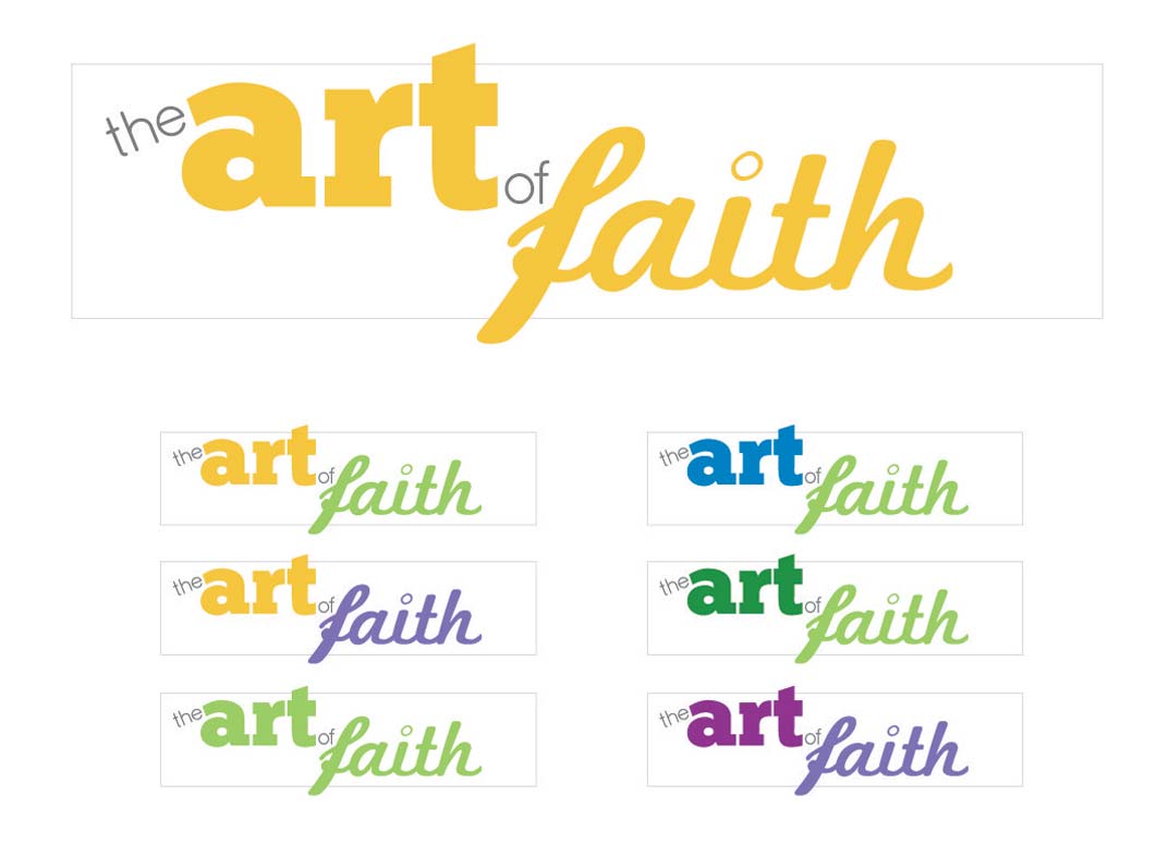
the-Art-and-Faith-logo Version1
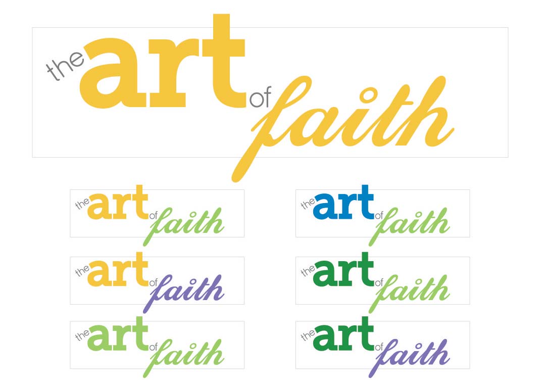
the-Art-and-Faith-logo Version2

The 2 versions shown here are the original (top), and remake (above).

I personally believe that the original version is better due to the bolder ChunkFive font and the combination of two script fonts in the word “Faith”; whereas the revision has a sleeker more contemporary look that has a similar weight among the 2 key words. When the logo is ‘finally’ approved by the entire panel of judges then the branding commences along with the website.

Categories
The Creative Cakery

Real Projects Work Placement

Currently I am working at Real Projects, a Norwich Based agency, where I am in charge of “the Art of Faith” branding, an exhibition happening later on in the year. So far I have spent a full day in the studio working on this project as well as being inducted into the way in which the agency works; a similar way to that of TSO, another one of my Work Placements in Norwich.

During my first day I spent a lot of time working out what the brief was and what the client really wanted, and whether or not they had any specific requirement, the only one mentioned within the design brief was to use the existing colour scheme, which luckily for me is 13 different colours and full use of any tones.

The project is not the most creative, but it is a real design brief that will go live shortly; the main thing that I want to get out of this is the experience of a commercial environment. seeing as the project has been going on for a few weeks now and the initial info has been sent out the logo/ branding had to have initial logo’s done within the first 6 hours of last Thursday, a tall order for student who would normally get a few weeks solid on a similar project, I did come up with 25 proposals but I only felt that one of them was good enough to get through the client, but in the end me and RP decided to send off 2 versions for approval.

Hopefully this logo will be approved on Monday and the website can then be designed accordingly, but from what I have heard NCC like to have input.

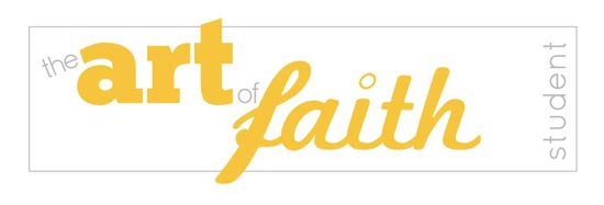
Seeing as I only liked one of the two proposals I have only got a thumbnail sample of my favourite to upload, which does mean that the images are low res and colours might not look exactly right. ALL comments are welcome.

Art-of-Faith-Logo for Students
Art-of-Faith-Logo for Teachers

Updates to come as I get them.

Categories
The Creative Cakery

Recap on the old blog

Previously…

{from the Bleeding Cowboys Fury Post}

I am the designer of the Discord Music Promotions identity and most of their publications, as part of this I have to speak to the manager and get the bands logos….

“Disaster strikes…. why oh why do all the metal & rock bands that are low-key use ‘Bleeding Cowboys’!?

I see that it is a nice font; but they all use letters that have swashes that overlap each other and generally just look shite. Now i mentioned this to one of the bands that sent me the logo, and said that I’d look into their logo and tweak it so that it doesn’t just look like the other half a million that use the same font. This was ok but when I showed them the new one they all voted for the simple ‘just typed‘ typographic logo.

Is this a cult where you HAVE to use that font to be successful in the music business?, NO, be original and think a little about how your first communication with the business world will be, the floods of these sort of logo’s positively annoy the hell out of me. At least use a different version of that letter so that you don’t end up with overlapping grunge beaten up distressed swashes that can and ultimately do end up with irregular images being formed for no reason other than ‘following suit‘ and pure down right laziness.”

Recently I didn’t get time to design the latest poster which you can see on the website, the manager himself designed it, so the level of creativity is not exactly there but I suppose the main info is. I will be getting back into that designing later on.

____________________

I designed and coded Drive with David, which has recently gone live and is doing well, the user interface has had many positive comments.

{from Driving Website Update Post}

“As no one know I have been working on a website for a driving instructor; the template is rather simple and the layout is modern and practical, there is nothing special about the coding either. All this said I feel that the site works really well for its demographic and is really easy to navigate around the site.

Today I found out that it was going to be going live, Yay, but there has been a technical problem which saw the site become a directory list, nay, I have since contacted the owner and now I’m going to try an upload to get the site working to its full potential.”

{from Drive with David goes Live Post}

“The website is now finished and live, from the earlier post you know that I had some designing problems with linked CSS files but I have since, fixed this problem.

My CSS is working, the spell checker has been done and the content is new a web design and not one of those driving websites.”

I have some plans in process for this site as it is seen as my flagship design but I haven’t got round to implementing these yet, so watch this space for updates.

____________________

During the summer of 2009 I spent 3 weeks at Blue Hat Technologies (now the yolk), which are a team of web developers.

{from the Work Placement Post}

“I’d previously met John, managing director, after a web-based lecture earlier in the year; the first few days were, boring where not a lot happened but this was acceptable seeing as I didn’t know any of the web coding that they use so I was on set up and updating email accounts/ blogs for the up coming Twestival.

The Twestival stuff that I was involved with was the lower end of design that I have previously done, the lack of design software was a BIG problem for me, only having internet access and Photoshop CS3 made layouts and text very difficult to work with on the slow machine.

The designs were ‘ok’ and I think that I can take them now and improve on them for the future.

The Best part of the placement was learning some HTML / CSS and web-based information with Tom Clark, one of the guys on the development team; he managed to help me create a fully working, easy to update site using new coding techniques and skill in 3 hours spread over a few days, this for me was fantastic! The site is going to be used once finished and I can’t wait to post a link to it, for the person that reads this. Blue Hat are very good at what they do but I wouldn’t get them to organise a charity event in 3 weeks.”