Categories
The Creative Cakery

Long time no Blogging

March 5th you say, this being the last time that I blogged about anything, let alone anything interesting.

The reason for this lengthy gap is that I have been concentrating on university work and I’ve also been on holiday; only 4 days away in the UK but a holiday none the less, a few days away from everything – except the weather –

I have also been doing a lot more design work for Real Projects and the Art of Faith Exhibition, of which there are a few updates but no images, this is because I have not finalised the majority of the designs and want to unleash them as a sneak peek just before the live date which, assuming everything goes to plan will be the 15th April.

1.The Website has been completely designed & is currently being coded.
2.I have been working on some of the game designs, but only one is finished, and is currently being approved by the client.
3.The Pledge wall has been sent off to be coded.
4.The presentation at the Cathedral was to showcase the designs to a selection of trustees and teachers.

and finally I’d just like to say that *This* work placement has been the best so far, the guys at RP are very good at what they do, they have allowed me to creatively tackle this project on my own most of the time which has paid; the interactions with clients and the large, daunting presentation has only helped me to develop.

-Aside from Work Placement-

I have recently been on holiday with my girlfriend to the western side of England, this being mainly the Somerset area; we stayed in Beckinton, and visited Bath, Bristol, Frome, Cheltenham. The reason for the visit was a holiday and an art trip, we scoped out there area first and found a little gallery doing an exhibition on Tea, which Kirsty is currently looking at for her studies, as well as textiles.

For now this is all I’m going to say here, as i am going to create new posts for all of the reviews and nuggets of info/ design.

Categories
The Creative Cakery

{iSlayer Review}

As noted in the previous post I don’t normally write reviews about things, it always seems like a waste of time and normally I feel that no one really cares what I think, but what the hell I’m going to tell everyone anyway.

Bjango

Bjango apps

islayer

islayer apps

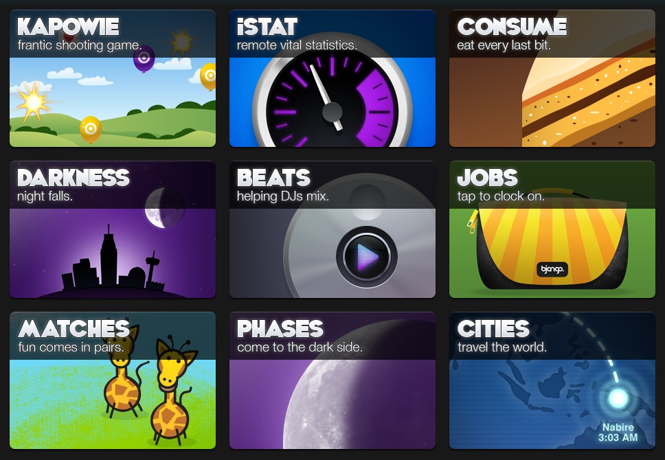
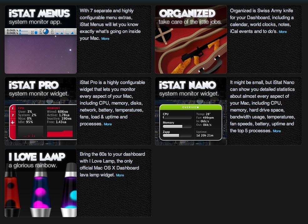
iSlayer is a small software company who design & build Mac related software; this is broken down into a few categories; one for the iPhone, one for Mac computers and out of these you have some very good statistic tools as well as the ever nostalgic and brilliant Lava Lamp.

I have recently started using iStat Menus as it was compared to a network tool called “DU Meter” but for mac; this tool allowing me to see how much data had been used since log on for the broadband as we have had some download issues, which we found out to be the throttling of Virgin Media once you have exceeded the ‘fair use’ policy the internet download speed went from 10mbs to 0.3mbs.

iStat Menus is a very complex and useful tool for monitoring computer temperatures{making sure that it’s not overheating, make sure that things are working properly, to make sure that the fan is not obstructed}hard drive use and capacity{useful to see if you are running out of space} and the reason I downloaded it, the network functions{how much data you have used, which helps you keep an eye on prices if you have to pay for data, e.g mainly if you have a portable computer with 3g internet} the applications are very well designed, easy to use, handy tools for everyday statistics (although not a big feature, you can see how long your computer has been on in that one session, the average is meant to be 5 hours)

If you have a need for any of these apps I highly recommend them, if you have an iPhone there are some apps for them which do the same things, but those ones do cost outright (one of my friends has, based on my review, downloaded the iPhone stat app and the Macbook pro iStat server and can now wirelessly look at his computer to see the basic information about it, useful for when he leaves his mac in the studio and go to the print room, it will let him know if anyone as if we would has used his mac while away to say watch some funny cat videos on YouTube)

iSlayer should be at the top of everyone’s download list.

Categories
The Creative Cakery

{Recommendations}

I know that this is not what I normally do but in this instance I feel that it was a good idea.

Anyone using a trusty Apple Macintosh Computer whether it be MacBook, iMac or iPhone one of the best website to visit is:

islayer or their iPhone dedicated site Bjango

They both have free and paid applications that are very useful for everyday tasks and additional features that you might like to look into. I currently use:

iStat Pro widget

iStat Menus

Organised widget

there is a iStat Nano for those who would like to see a select few details and don’t want to faff around with the pro version that has a lot more advanced features.

On a side note, Onyx is a brilliant tool for cleaning out the clutter that a computer makes on a normal day, these tasks are very simple to use, in fact the easiest way to do a decent clean is tick all the boxes on the automation tab and execute them all.

Categories
The Creative Cakery

Real Projects and the Art of Faith updates

This being a weekly thing sort of makes it seem repetitive, and especially when I forget to update on the thursday and wait till the following week. Back to business, the day on placement went well, starting with a morning chat about the web design feedback from the client.

Overall they really liked the design and had minimal updates to the original template and designs, these got corrected fairly quickly so that I could start working on a skin for the Pledge Wall, this is a flash area that displays messages from people about the event or just thoughts and images, as they have got the functionality to do live painting built-in. This flash area is static and cannot be moved but they needed a skin to go around it that follows the same theme as the website, the tasked seemed very simple to begin with but once I got into it the designs seemed to get a lot harder, a few designs were done but I’m not completely happy with any of them.

The next stage was to create some corporate guidelines so that all additional designs could adhere to my designs, this was a big thing for me as it meant that I was creating a new brand that other people will be following, to think my designs will be live and out of this I’ll be telling people how to design for it. This is a BIG thing for me, almost as good as seeing a design of mine on a billboard (the thing I’m working towards), so far the most exposure I’ve had is this project but I did once create 2 flyers for the Great Yarmouth Borough Council for some services that they do, a localised exposure but it was worth it. The guidelines were only started before the day was out but I got to do 5 pages, one with the logo exclusion zone, various colour-ways, colours, primary font and safe font.

Next week I’ll have a proper update with images as the website is going to be coded after next Thursday.

Categories
The Creative Cakery

Morning Critiques

This morning was going well, the day started a bit boring but it was a normal morning of boring things; then I arrive at the studio to find a group critique, seems fine enough, wrong.

Firstly I find out that the person’s work that is being talked about cannot speak, and all the work that is being shown is the finals or very latest work, this led to the first person having a sheet of paper on the table that was ripped to pieces that turned out to be that of the actual logo currently in use and thus pointless for the person in question. The whole no talking thing got better as other people had their work on show but in general this was not a brilliant idea, but nor was it a shite idea.

Secondly, a while ago someone said something that made sense and now it has become a catch phrase for the tutor in all possible situations; this phrase being “you’ve got to have a fricking idea” and it worked out that this was being said every 25 minutes or for every critique, which annoys me immensely for the fact that we were all there when this was said and we get the point and we know what this is, means and everything else that could be used to sum up the concept of this. This is on the same level of annoyance as the Catherine Tate saying of “am I bovered” where everyone will say it and within a few days it was feel decades old.

Thirdly there are a few people who always do the same sort of stuff and always get the same sort of grade then it turns into being that they are the only ones who could possibly do that in a project, but when someone else tries to do a similar thing they can be put down for it, not the style or medium but the idea of sticking to a way of working, more annoyance.

Forth and finally, Book Jackets, Spines and the reasons for buying a book. Maybe I am a strange person but I buy a book based on the content and maybe the spine but never the cover, this said the covers can look good and cause curiosity but I feel that the whole art of Book Cover design is wrong. I don’t care about the front cover of a book, if i am looking for a book to actually read then I buy a book with a good story, if this is a design book i expect the cover to have been designed, a book that is meant to educate me has to have the right words in it to teach me the subject matter that want to learn. A novel get printed on the strength of the writing and people buy books to read a good story, people who care more about the design of the front cover is either designing it or never read.

Ranting aside the people who got critiques had a lot of good feedback and some have a clear route to pursue.

Categories
The Creative Cakery

Art of Faith Logo Sign off & Website Design

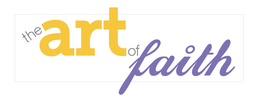
Last Thursday during my usual slow morning wake up and somber walk down to Real Projects at the horrible time of 8:30am start; I found out that one of the logo designs had been signed off as the final version, this being version 2 of the second round of designs and not in the before mentioned yellow and green but the Yellow and Lilac with the deep Grey for the smaller words, serious design to continue from this.

This logo should start appearing on stationary and websites.
the Art of Faith Logo Final

There are a few minor tweaks that I would like to look into before this is the full final no return design, but these are so minor that they wouldn’t matter if they could not be used.

The next step on the design list is the website, once I had settled in on the Thursday I got the message that the corporate style site is more likely to be used and thus the designing of the website skin to go over the wire-frame had commenced.
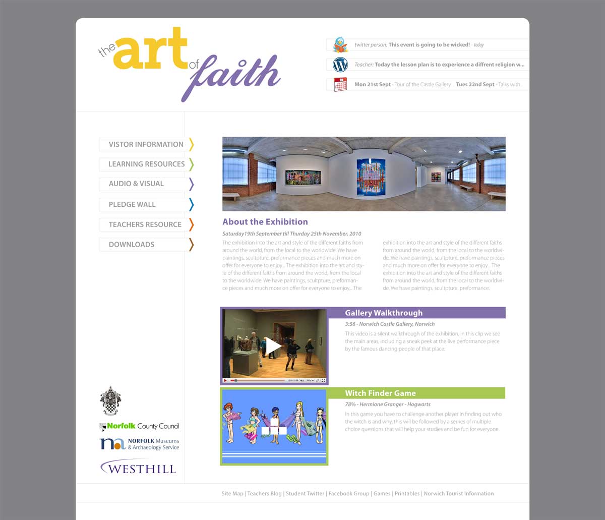
The idea was to keep the site as simple but functional as possible while not showing faith or make either of the users feel as if they should be on another site, for this I kept the white theme for the main site, applied a deep grey background so that the white area standout better and applied colour in minimal ways so that, when they are used they are the most dominant and thus easy to find, navigate and search through.

the Art of Faith Website - Home

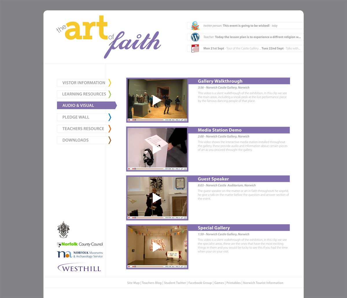
the Art of Faith Website - Audio and Video

The little things that happen are; when you hover over a link in the navigation bar it reverses colours and become a focal point, by using the block colour and the extension, on each of the pages the items are highlighted in similar ways so that they can be identified as the right content, and when more of the pages are sorted out along the bottom of the site there could be a block swatch with all of the colours so that the user could also use these to navigate if they were familiar with the areas.

The initial feedback from the client has been positive and thus this Thursday will be creating the rest of the pages or tweaking the template so that the web developer can start on the coding. {updates to come}

Categories
The Creative Cakery

Drive with David Website – with images

To begin with this is more of an amendment than a new post, but editing a previous post seems counter productive considering I want to get this noticed.

Back in November 2009 I completed a website design and development for a driving instructor in Brighton, there was some problems and such like, as you’d assume with technology and a new set of skills; this led me to get the project signed off and it is now in the care of the owner, the site has changed slightly since my final design but nothing that makes the site any less functional.

The site that I completed looked like this:

Drive with David Home Page

Drive with David Instructor Page

Drive with David Lessons Page

Drive with David Useful sites Page

The design was set up so that all the information would be in direct view of the viewer, the scroll bar was not needed and this allowed me to play with old coding, as well as the newest to create a unique layout and style that is not like any of the other driving web sites. To see any updates or if you’re looking for an instructor visit http://www.drivewithdavid.co.uk/

Categories
The Creative Cakery

Typography

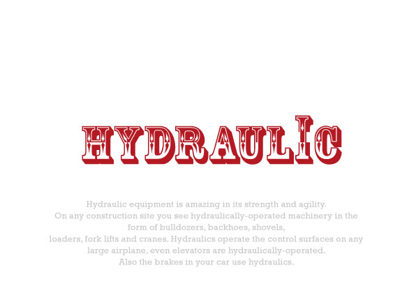
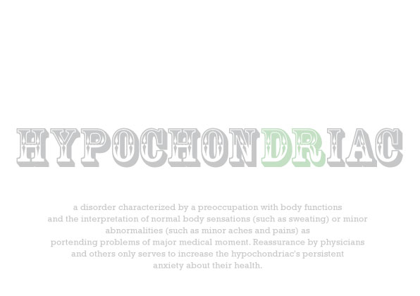
During a lazy day I decided to play with the font “Rosewood std” and see what I could do with it that was not carnival or similar, so I found some random words and type set them to explain what the word meant.

In the 2 version I have done it was relatively easy to do this but it wouldn’t always be like that in the task; either way have a look and see what you think.

Hydraulic in Rosewood Std

Hypochondriac in Rosewood Std

Categories
The Creative Cakery

Art of Faith Identity Update

On Thursday, I went to Real Projects like normal; but this day was not like all the others, in fact it was a lot better due to a few additional activities. Firstly I get in to be confronted with wire-framing 2 websites of which I needed to show 3 pages from each; this in context was a lot easier than the afternoon.

Upon coming back from lunch I’m told that someone from Event was coming in for a catch up on the work produced; this immediately became quite frightening but exciting at the same time as I have not had any involvement with clients before, and then I get told that I will just be sitting in on the meeting to see what it is like, ‘wipes brow’ with sigh of relief that I’m just watching.

Change of plan, we get in to the meeting early as the client has turned up, we get into the meeting area and to begin with I’m asked to present My work to the guy without any additional input from the team, to be fair it was my design and I can explain it a lot better than the guys at Real Projects but, it threw me off. AFter the 10 seconds of shock I get into the pitch; which went really well, I pointed out the logo that I liked, the client agreed, I then presented the 2 colour-way boards and the general consensus was that version two was the better version and that he liked the yellow and green combination.

The logo is now almost signed off as either the yellow or yellow and green version in the sleeker fonts.

Art of Faith LogoContinuing on from this I went through the corporate style website as the other one had not been spec-ed up. The layout was very simple and the content was basic at this stage as we have not received any of the actual info; so I have to make up snippets of text as I very much dislike ‘Greek’ as placeholders. As I say, the websites are very basic and with minimal colours, shapes style and information but the layout is there at this initial stage of the design.

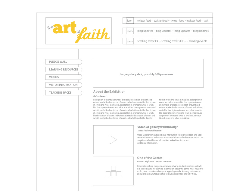
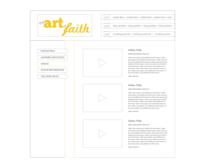
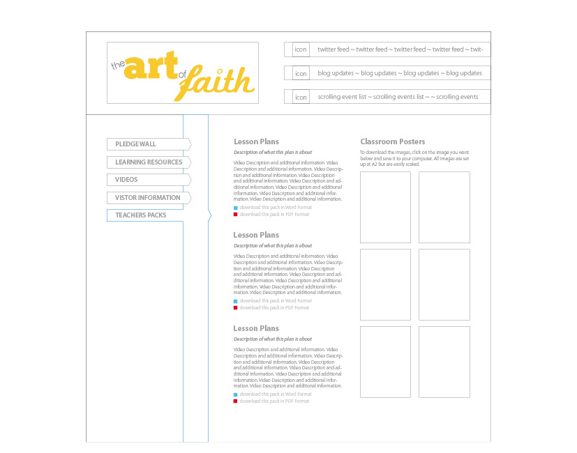
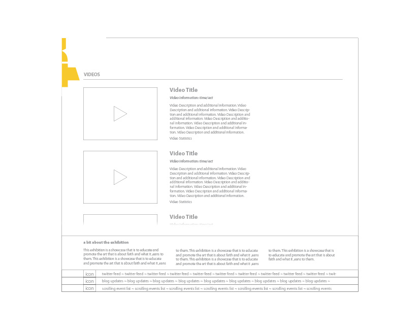
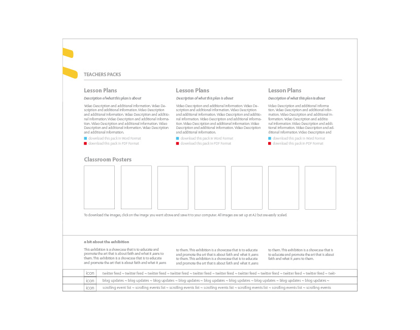
On the home page you have a summary of the website, this includes a large image of the event and some snippets of whats to come; on the Video page you have a simple 2 column layout with the video window on the left and the information on the right & the Teachers page is mainly text-based but I wanted to make the entire website visual so I have implemented an images column on the right.

Home Page

Video

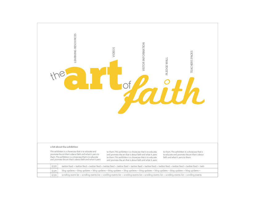
Teachers The way in which you identify the current page is by the coloured bar that runs down the side of the navigation bar on the left. Although I could not show the client the fun site I’ll upload a snippet of this for you to see the idea.

Home Page Fun

Categories
The Creative Cakery

Stew Gallery Private View Review

Unattended the exhibition with my Girlfriend, Kirsty Bell who was one of the artist on show, her piece “Where’s the Great” featured 3 cup and saucers made from fabrics placed on plinths, 2 of which were knocked over; this was the title in action where the point is saying that British heritage is tea and by them being knocked over it represents the fact that we, as a nation have lost the right to use the word Great in Great Britain.

The cups themselves had been crafted beautifully, from the size of the cups to the sticking that visible, the final pieces were very nice to hold but I feel that they weren’t as bold as they could have been in order to take advantage of the space given and the room that they were placed in, bolder, larger cups could have set a striking center piece for all that walked into this area.
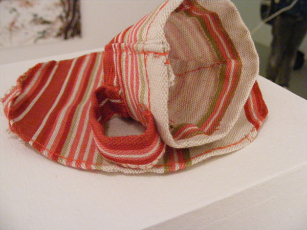
Red Tea Cup and Saucer
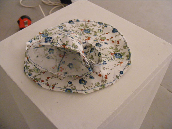

Blue Patterned Cup and Saucer
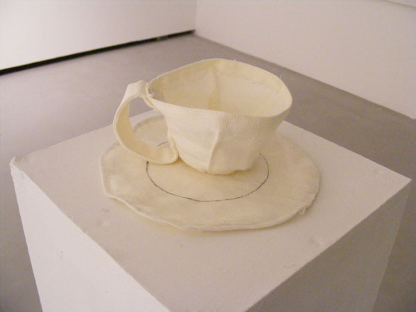

Cream Canvas Cup and Saucer

Although attending for these reasons I personally liked:

A big canvas painting that featured a woodland scene; the brush strokes were beautifully crafted and the composition complimented its arrangement – Charles Daborn, who not only provided this painting but was the live music for the evening, the selection of songs and melodies made the event come alive and helped to alleviate the awkward silences that surely would have occurred in such an environment.

A large portrait painting that was photo realistic, where at first glance you can be fooled into thinking that it was a photograph and even on a closer look you feel that your own eyes are tricking you, but it’s not, the painting has been crafted with excellence and precision – Amy Rogers

A large cloth with an architectural piece drawn on with what looks like marker pens and fine liners, the basic shapes that are highlighted by the flourishes of colour and line make this piece one of my favorite as it is about architecture and structure within urban environments – Graeme Crorkin

A collection of small hand sewn images about the blood donations process, I think that this version is very much noteworthy for their honest depiction, design styled look, carefully crafted stitching as well as the way in which all colours have been eliminated to highlight the blood-red in a single frame – Charlotte Carver

A large canvas that has been attacked with different colour paints, that have been highly watered down, the canvas was held up and the paint was dripped down and this created the lines that you see, a huge grid like formation with no coherence but bundles of character and is very pleasing on the eye – Andrew Pointer

A medium landscape painting that can only be described as swirls in flames, the paint had been applied thickly and then with a small blunt object areas had been moved around to create movement which just looked amazing up close as it did from afar – Ruth Stanley

And the most inspiring piece was a pair of larger drinking robots; the idea is amazing the execution was flawless, well almost and the placement caused the robots to have shadows that were just as good as the real metal object. The duo continuously raised the cans to there square mouths before putting it down again ready to repeat the process, which was and definitely will be mesmerizing to all onlookers – Guy Copland

The worst part of the exhibition was the time in which I turned up, this being thirty minutes into the private view meant that, on Pancake day I was late for the stack of pancakes that were on offer, the carrots didn’t really make up for this but it was a nice snack none the less. The event went really well and the turn out was a lot more than expected, which meant that in places at times there was more people to art work and thus very hard to manoeuvre the gallery space.

On a side note, the drinks set up before the doors open looked like art work on their own.
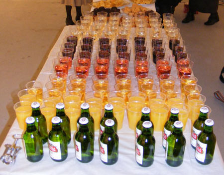
Colourful set up