Categories
The Creative Cakery

Hever Castle and it’s many wonders

It’s been a long time since my last post and a long time since visiting Hever Castle; but I feel that it is something worth sharing none the less.

A few months ago I visited a friend down in Tunbridge Wells, a place that I had previously visited the Christmas before he moved there; this time the castle was open on the days in which me and Kirsty had decided to go down, meaning that the trip was worth the traveling. A bit of personal history to start this off; My Girlfriend and I are keen travelers, mainly around the UK and mainly to places where the arts are, Galleries, shows and Architecture primarily, where we both have a love for the reign of the Tudors, and who doesn’t know of Henry the 8th, the most well-known and prolific of all the countries rulers, whether it be for the 6 wives, the constant betrayal of trust between himself and all of the alliances he set up or for the way in which he conducted his business, it’s fair to say that he is one of the greatest Monarchs of the England, and I for one love this.

The day as it unfolded, the overcast morning seemed to impact our expectations of what it would be like to visit the castle, as there is nothing worse than a horrible rainy day walking round a giant garden, especially if it could be so much better during a nice day; the weather in fact got better, a cloudy morning turned into a sunny afternoon, and upon arrival we headed straight for the lake and Italian gardens.

Categories
The Creative Cakery

American Museum in Britain – Claverton Manor

On the last day we decided to visit 3 places that we hadn’t been to, the first being Frome (no post needed to sum up a small town that seemed half closed due to weather, except the fact that down one of the main streets there was a one foot gap running all the way down the middle which turned out to be the main guttering, how quaint.) and the second being the American Museum in Britain, a place that was mainly for Kirsty as she wanted to see the Quilt Exhibition that was running, but seeing as i had to be there also we explored the whole house and despite the rain again we went through the gardens, but not on the trail.

The house itself was located at the bottom of the hill originally but during its conversion it was taken down and re-built on the top of the hill as it had a much better view; with the house relocated the interior was being sourced, yes Sourced as all of the rooms in the place have been taken out of real American homes in places like Massachusetts(yes I Google-d that name) and New York. When I say rooms were taken I mean Rooms were taken, skirting an all event he wallpapers and floor boards; which is a strange idea but one done for a good reason, why try to replicate an American house when you can have the parts of the house you want to show made from actual materials from the period and location you want.

Categories
The Creative Cakery

Jaw Dropping Realisation

It has just occurred to me that I have found a very good piece of software for blog updating and editing, the controls are very easy to use, the layout is minimal but functional and the options are phenomenal. The easy to understand part is over, and now comes the part that might just stop you in your tracks, makes your eyes widen and your mind explode, because I am talking about a piece of free, almost default software that comes straight from the headquarters of a company famed for being bad with software(from my point of view and that of all Mac users) that being Microsoft, yes you heard me right, Microsoft have made a great big leap in the last year, firstly with Windows 7, a fantastic upgrade from the abomination of Vista and now with a piece of software that makes blogging so god damn easy that even more people could start a blog and do it well.

The Software comes in the Windows Live Essentials pack which you can download from there website, or if I recall correctly it is an optional download within the windows update control panel within Windows 7, Windows Live Writer is its name and blogging is the game that it plays very well.

I have tried Contribute, and it failed, so I use the web to update blogs straight from the WordPress Control Panel, which I find to be very good at its job but Live Writer is so much easier; setting up default actions is a click or 2 away, these being images sizes from a drop down menu, inserting images is as simple as clicking on the file, the adjustments are fluent and the advanced features are intuitive. And I am fully aware that a lot of people will disagree or being a Mac user, not able to test out the software, so I am so glad that I decided to dual-boot a while ago, mainly for cheap games, but now it seems, Blogging.

{Windows 7 plays very nicely on a 2010 MacBook, with a small partition of just 45GB, mainly games as I have mentioned, drivers work straight away, the navigation is simple and I’d highly recommend it to everyone, even the Mac-Fan-Boys, of which I am an avid supporter of the Macintosh Computer Line up, excluding the MacBook Air, and the Portable Devices excluding iPhone, iPad and iPod Shuffle, the Apple TV is in limbo.}

If you are able to test out Live Writer, do so, the setting up took me 5minutes in total, that’s including the customisations to images and posting.

The only thing that still annoys me about all of the different blogging software is that none of them to date, will correct the lowercase ‘i’ as I type, which is a simple feature that I use in all the time within the Creative Suite and Office and cannot find a solution to the problem within Plug-ins or extensions.

So if anyone knows how to solve this, comment below.


http://explore.live.com/windows-live-essentials?os=win7
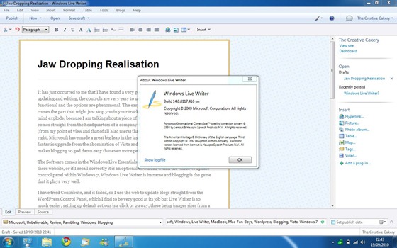
Live Writer2

It’s so simple, so easy to use, so good at what it does and yet it feels so wrong, a product this good should be developed by third-party developers in response to Microsoft’s appalling software department,  and yet it isn’t, could MS being getting better? is it right?

Categories
The Creative Cakery

Several Decades of Pleasure

That is to say that you have to love comic books, I mean really love comic books, which I don’t normally, but when you see this collection I promise you that you’ll want the computer screen to suck you into the screen and teleport you here. Literally!

I’m not talking about a small collection of comics, or even a medium-sized collection, I’m talking about a huge, collection of Super Hero/ Villain comics from the trusted DC Universe coupled with Marvel, 2 of the most prolific writers and illustrators ever. Opinion of course, but the opinion of several million people worldwide, and if you are not one of them, shame on you!

The Collection

You see what I mean? the biggest collection of comic book that I have ever seen, there are so many to count, too many to read within a year and far too many to even begin to upload shots for your pleasure.

Sorry, silly me I have used the wrong shot, let me have a look for the right one?! Here it is:

The Room

And before you say “that’s not a lot” I have to point out that there are 2 more rows below the picture, there are 10 boxes like the one shown at the bottom, the one with “OBI” on it that are packed full, there is a half-size shelf to the left and a filing cabinet to the right also filled up. That’s approximately 10,500 of the standard paper sized comics, 2,300 paperback book sized comics, 800 comic annuals, and a further 4,000 a4(ish) comics in hardback form; so correct me if I’m wrong in saying: ‘you, the reader are now trying to get the teleporting screen trick, mentioned earlier, to work’ which might seem a little odd to some people to perfectly plausible to me.

And just for those who are reading I have a few pictures that you might like, they all come from the same series, that being ‘Final Crisis’ dating 2009 German publishing.

Stack

And a few individual copies that I particularly like.

Final Crisis Green Lanturn

Final Crisis Super Woman

Final Crisis with Gun

Final Crisis Blue Man

Final Crisis Bat Man

Final Crisis Bat Woman

To top it off I found this very nice, yet horrifying image within one of the comics, and seeing as I don’t have time to look through them all this is the best image found as a first page turn.

superman and batman

And finally, a ‘Marvel Monster Edition Comic of Captain America’

Captain America Mega Comic

Hopefully I will be able to see a lot more of the comics while here, in Hamburg and even get some nice examples of these classics.

Happy Drooooooling.

Categories
The Creative Cakery

Mega Awesome Retro Vintage Television Title Design

Now, to begin with I’d like to declare the fact that I am a big fan of this style of design but I have not been able to mimic the style to give it the justice it deserves. Secondly I did not grow up with this show and have fairly recently stumbled upon this gem of design, and I love the show almost as much as I love the title that precedes the show itself.

The show in question is “Jeeves and Wooser“(imdb article) which stars the infamous Stephen Fry (@stephenfry) and Hugh Laurie.

{My Synopsis: Laurie’s character Bertie Wooster is a dim aristocrat who has the very intelligent man-servant Reginald Jeeves, the man who sorts out most problems that present themselves. It’s a funny, witty sitcom that is enhanced by the cast, that can also seem a bit outdated to the youth of today.}

Title


Jeeves and Wooster Title2

Jeeves and Wooster Title3

Jeeves and Wooster Title5

Jeeves and Wooster Title6

Jeeves and Wooster Title7

Jeeves and Wooster Title10

Credits

Jeeves and Wooster Credits4

Jeeves and Wooster Credits2

Jeeves and Wooster Credits3

Jeeves and Wooster Credits1

The Design

This design has become popular by the phrase ‘Vintage‘ or ‘retro‘ despite them also describing a lot of the design from the 50’s and 80’s respectively, where the show is actually set during early 30’s, pre-second world war.

I love the simplistic block colours and graphics, they are however, much more elegant during the title sequence than they are as flat graphics, I do however love the idea of having a series of postcards, posters featuring some of the graphics on show, especially the car, the title of the show, the 3 musicians above the actors names and the chairs, also with the actors names below.

The scenes blend together beautifully, a man playing the clarinet pops up behind the drum player within a spiral, and as the music continues, a car drives past the stage taking you towards the next scene. these little transition last a few seconds but look amazing within the context of the design.

Categories
The Creative Cakery

The Past in the Future: A Television Story

Today, while watching John Bishop’s Britain online I noticed a familiar object that has been part of my life for 11 years now, a familiar wooden box with buttons and a highly curved screen, an object that represents 2 weeks wages when I was 10 and that has been the best buy of my life so far. The object in question is a Mitsubishi colour TV. {the one shown int he show is slightly different to mine in that it has a volume slider where I have volume buttons, up, down and mute.}

Mitsubishi tv

The reason I find this so interesting is that I have been very curious about my television since buying it and a few years a go I send all the information I have about it to Mitsubishi to see if they could tell me anything about it, but alas they knew nothing. The e-mail basically said that they have not got this TV on there records and could not tell me anything about it; which was a huge disappointment, that came up even more so than my Google search to find out more, a search revealed that the serial code of the TV was that of a jet engine used in Japan, of which I say that this is the only jet engine to pick up TV without an aerial, all be it very fuzzy, but with visible images and high quality sound.

Some people know this story and others do not, whereas some might think that I do not even own said television.

My Television

With regards to the show I’d just like to say that your portrayal of this TV is not justified, although it cannot compete with today’s technology it works very well, lacking of ports and thus getting to the end of its useful life, but then I only have a Playstation 2 and that works fantastically well.

For those who will not watch the show and find out what the situation was that I disagree with I’ll sum it up.

The setting: A cottage in “the middle of nowhere” in a place called Berwick upon Tweed (John:”for those who don’t know, it’s miles away from anywhere, it’s on the border between Scotland, England and Narnia”)(Local:”Internet? it’s Berrick son, we haven’t even got CFAX”)

For those who like the authentic script and visual setting visit http://beta.bbc.co.uk/i/tn8lg/?t=20m05s

Categories
The Creative Cakery

Kerry’s Concrete Keyboard

Concrete Keyboard

A while ago we were walking towards a book shop near the Cathedral when we spotted this imprint of a computer keyboard in the ground, how it got there and why it is there we don’t know but it was a nice surprise. In this picture I believe the keys being used are “Command+Shift+Z” the command for redo but it could easily be anything else seeing as the keyboard is unbranded.

Categories
The Creative Cakery

Norwich Architecture Book is out of Storage

As I pointed out in my last post I have been revamping an old project; a 5 years old half project that I worked on for 2 months when I thought that my work was the best thing ever, the sort of thing that all those University going students would be jealous of, award-winning design, as you will now get I was a bit cocky with my design talent at the time.

But now the project has been brought back I can finish it off properly, a final design and information, great illustrations, facts and history and a few photographs which will hopefully bring back some of the history of Norwich in Architecture.

New Book so far
New Front Cover

St Stephens

St Stephens info

Cathedral

*Details to be updated later*

Categories
The Creative Cakery

Norwich Architecture Book is coming out of storage

Way back during my A-Level Graphic Design days I came up with a self initiated project which was made up of 2 book that were to showcase Norwich; called “Norwich Architecture During the Day” and “Norwich Nightlife”. Both of which went through a lot of designing and led me to scrap the nightlife book so that I could concentrate on the architecture book, as this had a better idea and interested me a lot more as Architecture was my degree of choice before I found out about the cost and chances of that happening. The initial idea of the book was to just have pictures of the architecture then have the book look old and such like, more style over substance; this then turned into a larger project, a poster, badges and the book were my finals back in the first year of my A-Level.

As it had always interested me and that I really loved working on the project I brought it back to life in a ‘what else do you do week’ in the first term, back in October 2009. This led me towards taking new photographs where needed, and creating illustrations from them which accompanies a small description of the architecture depicted, but due to the degree that I have now finished I was able to set up a template for the book, which made the information standout as much as the illustrations which are still ongoing.

-The Old Version-
Old Cover


Just so you know, the text going up to the edges of the pages is not a web formatting problem but how I had actually designed the pages, and yes I know it is really bad typography, layout but a really nice concept and idea that I have been trying to get right recently. By taking the photographs again I can control the full look if the new design properly; the illustrations come straight from the photos and I take a lot of time getting all the details right as to do the historic architecture justice as well as give credit to the contemporary architecture.
As most people have not seen the architecture book I’ll leave this post for you to look at and hopefully comment on, the new versions will be posted soon.

Categories
The Creative Cakery

Two small stapled books on textured cream

Recently I brought some literature books hand-made by Victoria Burroughes, a student on Ba Visual Studies, at the Norwich University College of the Arts. These being the newest lot of literature that I have read from her it was a refreshment of the style of writing that she has; in some cases the poems are short and snappy, on the other hand she gives the reader a lot to think about whether it be a simple statement that we all feel or a narrative about the mundane journeys that we all will inevitably take at some point.

The Books

Poetry Books

Both books are designed in the same format and with the same feel and quality, a simple soft textured cream paper that makes all of the words standout in either black or deep grey. Design overall from my point of view; in order, the covers are controlled simplicity, a medium weight serif in two sizes with a lot of space to give the desired hierarchy. The contents page and copyright at the end of the book take the centred style, which to me seems a little strange seeing as the whole book is left aligned most of the time, even when the main body copy is justified in ‘Men’; the margins are set to a document, where the outside margins are the same but the inside margin seems to change which is probably due to the way in which the pages have been printed and bound together, which is understandable in this case. Other than the few pointed out design related mentions the book flows beautifully throughout, with little or not qualms or oddities.


“Poetry” Snippet

Poetry Book - Poetry

Nine poems that capture a moment in time, a simple statement about a friend, a journey or an injury. The words are both powerful and subtle, simple and complex the feeling that her life is like her poems, the feeling that a monologue is created just to imagine the events and situations happening, that omniscient listener to a souls thoughts throughout her life, captured in a few lines carefully constructed to maximise the impact that it has on the reader. Above the realism of all the events hinders the humorous undertones that give us hope of something better, happier.


“Men” Snippet

Poetry Book - Men

This book is the bigger of the two and is a collection of first person accounts of 10 different men in her life, portrayed with specific attributes to give the stories density in such a small space. For those who love to read about other people, the feeling of looking into someone else’s life, the big brother style fans that just watch people and in the end want to see what happens, the high lows and feelings felt by someone else without knowing the actual people behind the perceived, if you are that person then this book is your friend. Through the thoughts of a friend, lover and acquaintance you get an uneasy impression of her life, and in some cases a strange feeling that you are her, a puppet thought the eyes that you look, a beating heart of a hidden romance and the sadness that follows, whether it be an emotional tie to the stories of a memory that seems so real that your life has the same situations that seem even more real by reading the similarities.

I highly recommend these books to everyone for all the comments written above, you cannot help but be moved by at least one of the poems and equally so by one of the stories in Men.


Books Copyright Victoria Burroughes, Found at: victoriaburrougheswriting | victoriaburroughes, and can be brought directly from her, just email, or through Etsy.com