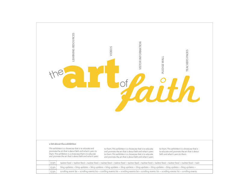
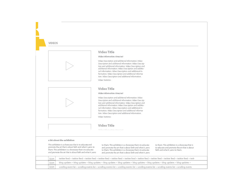
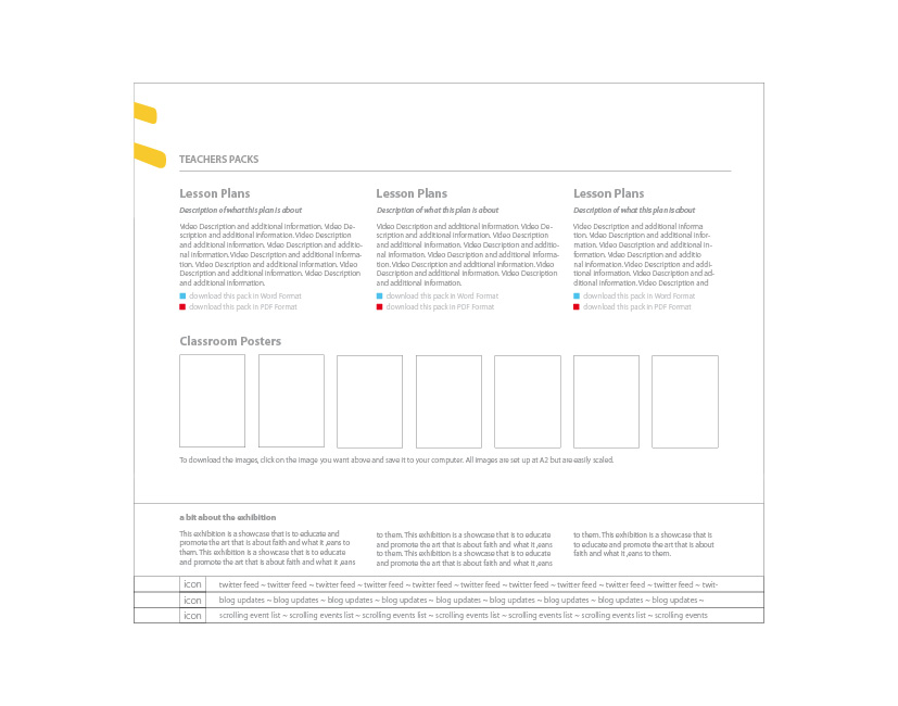
On Thursday, I went to Real Projects like normal; but this day was not like all the others, in fact it was a lot better due to a few additional activities. Firstly I get in to be confronted with wire-framing 2 websites of which I needed to show 3 pages from each; this in context was a lot easier than the afternoon.
Upon coming back from lunch I’m told that someone from Event was coming in for a catch up on the work produced; this immediately became quite frightening but exciting at the same time as I have not had any involvement with clients before, and then I get told that I will just be sitting in on the meeting to see what it is like, ‘wipes brow’ with sigh of relief that I’m just watching.
Change of plan, we get in to the meeting early as the client has turned up, we get into the meeting area and to begin with I’m asked to present My work to the guy without any additional input from the team, to be fair it was my design and I can explain it a lot better than the guys at Real Projects but, it threw me off. AFter the 10 seconds of shock I get into the pitch; which went really well, I pointed out the logo that I liked, the client agreed, I then presented the 2 colour-way boards and the general consensus was that version two was the better version and that he liked the yellow and green combination.
The logo is now almost signed off as either the yellow or yellow and green version in the sleeker fonts.
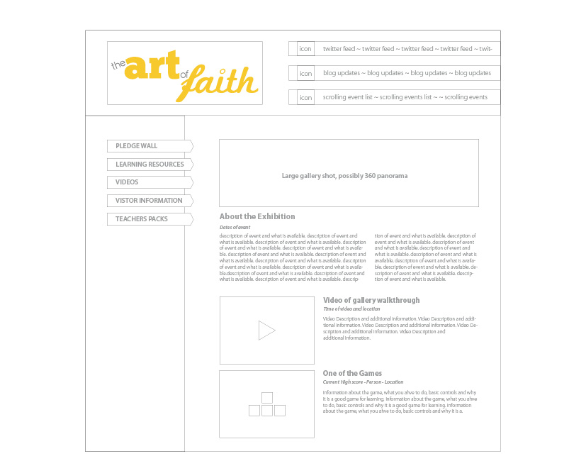
 Continuing on from this I went through the corporate style website as the other one had not been spec-ed up. The layout was very simple and the content was basic at this stage as we have not received any of the actual info; so I have to make up snippets of text as I very much dislike ‘Greek’ as placeholders. As I say, the websites are very basic and with minimal colours, shapes style and information but the layout is there at this initial stage of the design.
On the home page you have a summary of the website, this includes a large image of the event and some snippets of whats to come; on the Video page you have a simple 2 column layout with the video window on the left and the information on the right & the Teachers page is mainly text-based but I wanted to make the entire website visual so I have implemented an images column on the right.
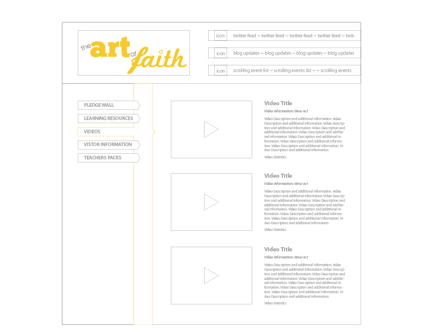
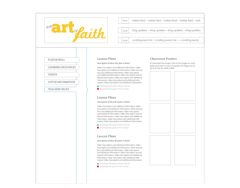 The way in which you identify the current page is by the coloured bar that runs down the side of the navigation bar on the left. Although I could not show the client the fun site I’ll upload a snippet of this for you to see the idea.
