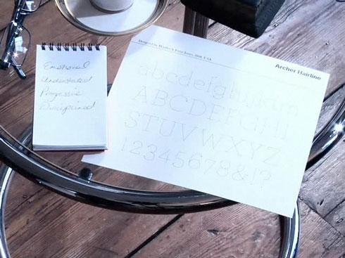
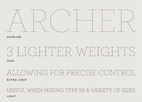
After completing a short type quiz on Pentagram’s website, I was told that my ideal font would be Archer Hairline, available form Hoefler and Frere-Jones. Like most people I hadn’t heard of this font before and was glad to have seen it because it is such an elegant font, and a font that I’d be delighted to use within some projects or to enhance my personal identity as an alternative font.
-The Typeface-

When you finish the quiz they present you with a type specimen so that you can see some of the characters along side that of the words you chose throughout the quiz, this allows you to see the font fully and ponder why that was the type chose for you.

As you can see the font is beautiful, the carefully considered strokes set with elegant droplets on the end of the curvaceous letterforms that bring the strong straight lines a quirky nicety that would normally be overlooked by less talented typographers.
-My Favourite characters-

Personally I feel that these characters are the nicest out of the full font, they combine the nice curve letter forms with droplet tips with the strong dignified straights with the numerals that are so clearly defined and the glyphs that capture all that is unique about the font throughout. Only when you see the letters being used can you truly understand why this font is so nice, among all the possible weights available you can create a poster with striking headlines, a leaflet with clearly organised information, a billboard that emphasises the nano-niceties or just body copy where the subtle weights lift imagery of the page, this typeface is amazing to see and even more amazing to be compared to it, like so many other people I’m honoured.
